Structure
The first definition of the noun structure is the arrangement of and relations between the parts or elements of something complex.
The second definition of the noun is a building or other object constructed from several parts.
The definition of the verb structure is to construct or arrange according to a plan.
The second definition of the noun is a building or other object constructed from several parts.
The definition of the verb structure is to construct or arrange according to a plan.
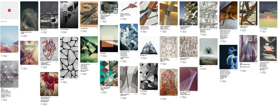
mood board
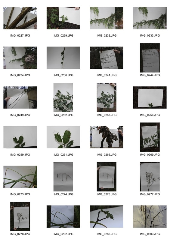
STRUCTURE in nature
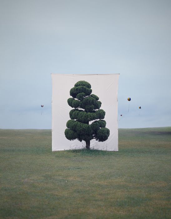
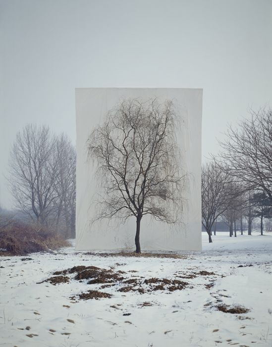
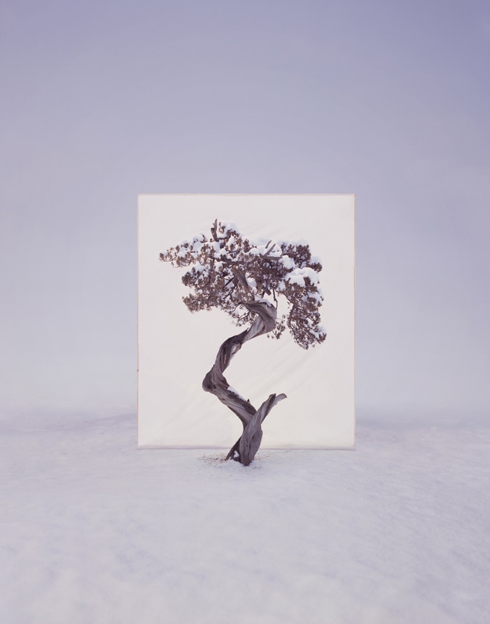
I looked at the work of the photographer Myoung Ho Lee, specifically his pieces titled 'tree' where he uses a white sheet as a back drop behind a tree often in plain natural areas. By using the white sheet he makes the viewer focus in on the structure of the tree trying to distance it from its surrounding landscape. Ho Lee is portraying the structure of the tree looking only at the tree and not the environment which it shapes or shapes it.
|
|
|
my response
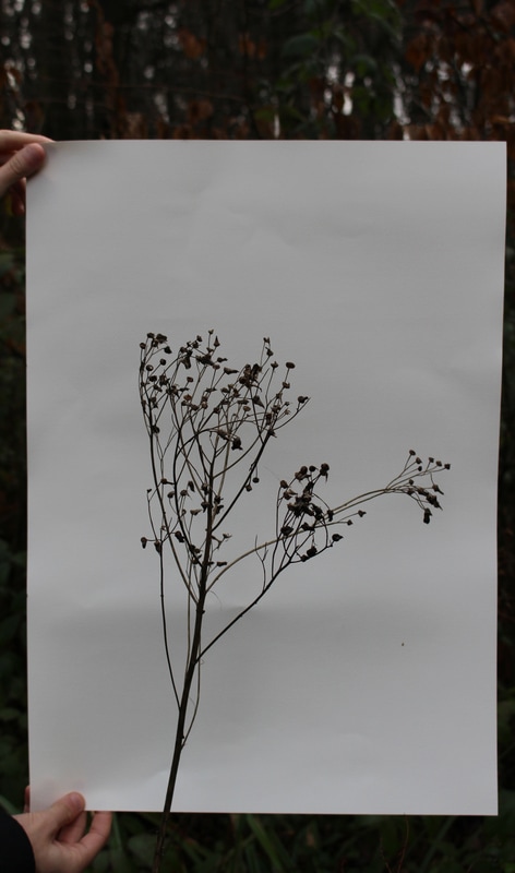
As a response I went into Coldfall woods and using A3 white card we found trees, leaves and twigs. We placed the paper behind the subject and took two shots: a close up where only the white card and the subject can be seen in the picture; and one where the edges of the boarder are visible.
WWW
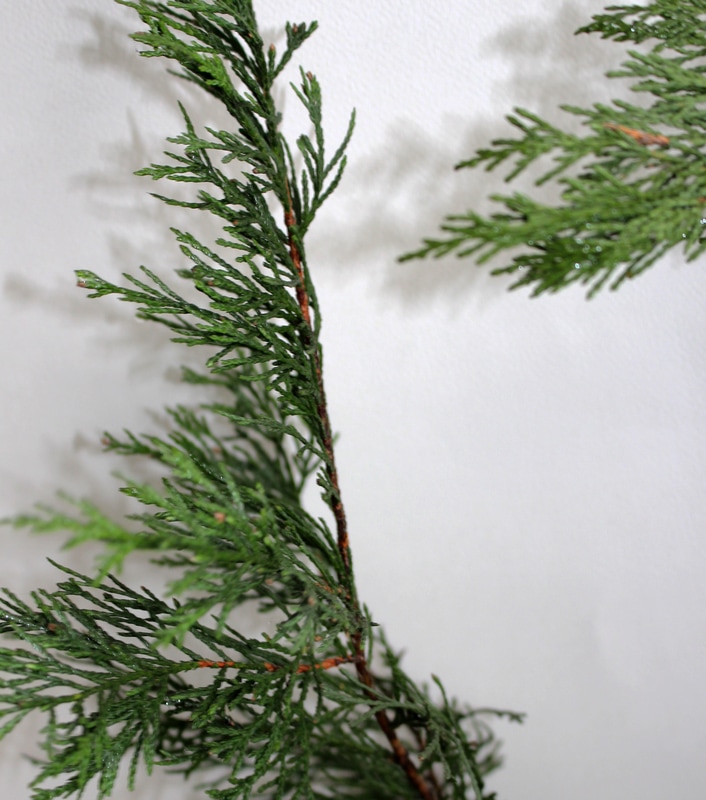
The white background brings out the complicated structure and interconnectedness of the twigs offshoots. EBI Find a way of not having the hands in the background. Focus and zoom in more on the subject as it is not very clear. |
WWW
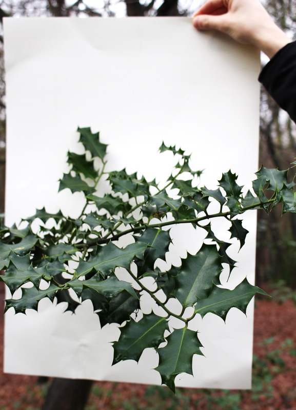
The holly leaves are in focus which is good and this is the subject and white provides a boarder from the holly and the woods. The dark green of the leaves is powerful and stands out. EBI I would have the boarder straight and closer to the holly so it to is in focus aswell. I would also try and find a way of holding it up without the hand in the background as this is distracting. |
sanna kannisto
In Sanna Kannisto photography she focuses on the process, her relation with her subjects and their relationship with nature. She is investigating the structure of the relationship between herself, a singular plant and nature in general.
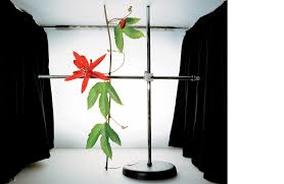
I think this on is good as the parallel and perpendicular lines makes the photo seem caluclated. The right angles give a structural feel associated in architectural photography.
|
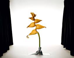
The vibrant leaves and plain background makes the plant stand out.
|
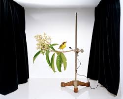
The bird on the twig makes the metal stand seem less man made and signifies a collaboration between nature and man-made structural apparatus.
|
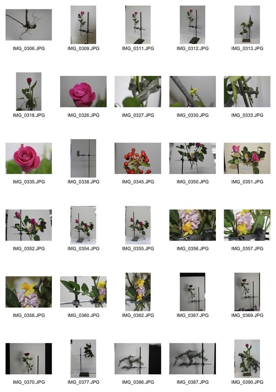
my response
|
|
|
|
WWW
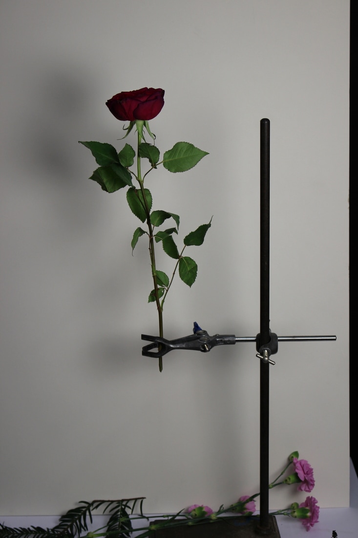
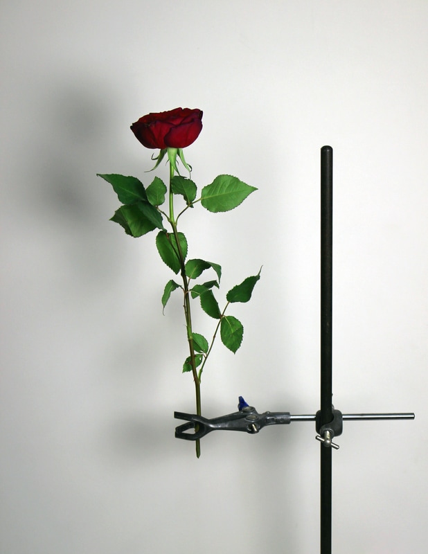
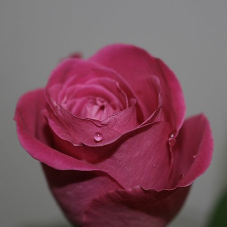
This macro shot is in focus which expresses the lines and contours of the petals. The water droplets and also clear and give the photo some contrast. EBI I think i would edit the photo slightly less as the purple pink colour of the rose looks artificial. |
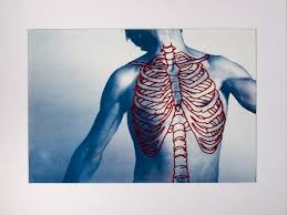
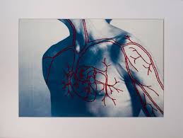
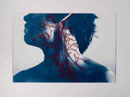
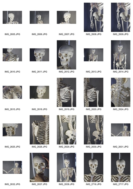
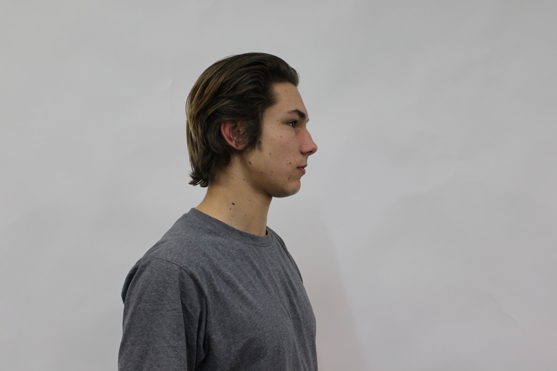
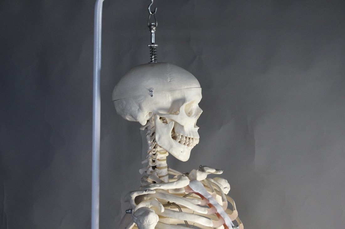
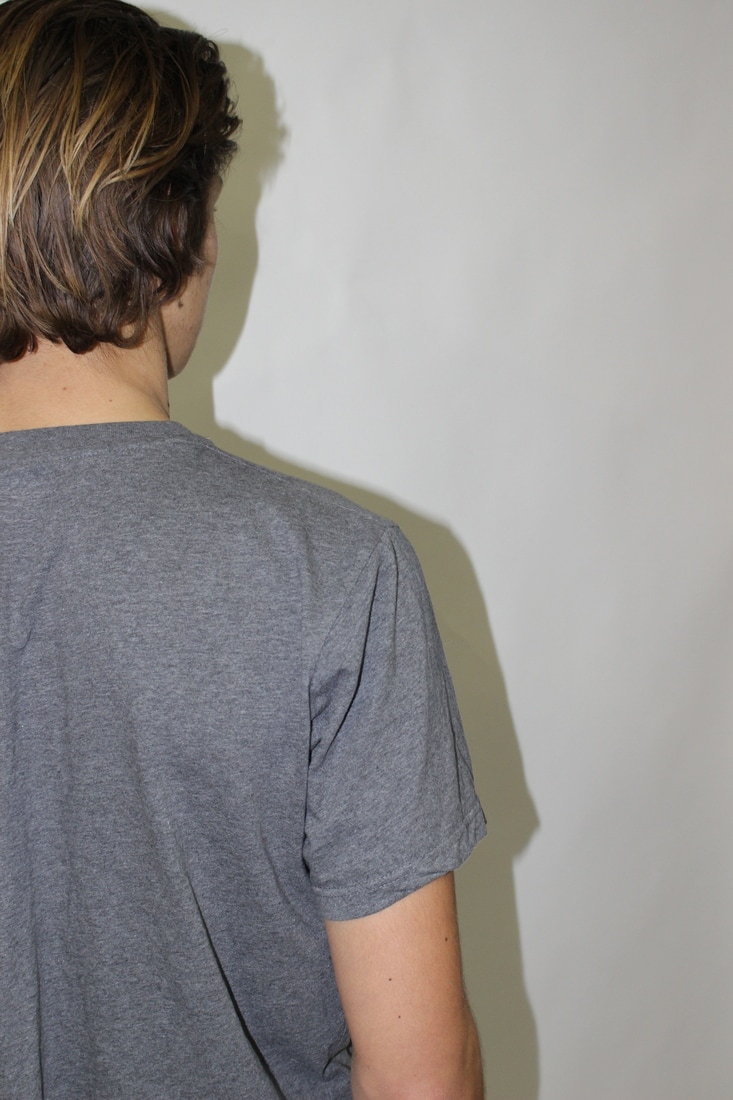
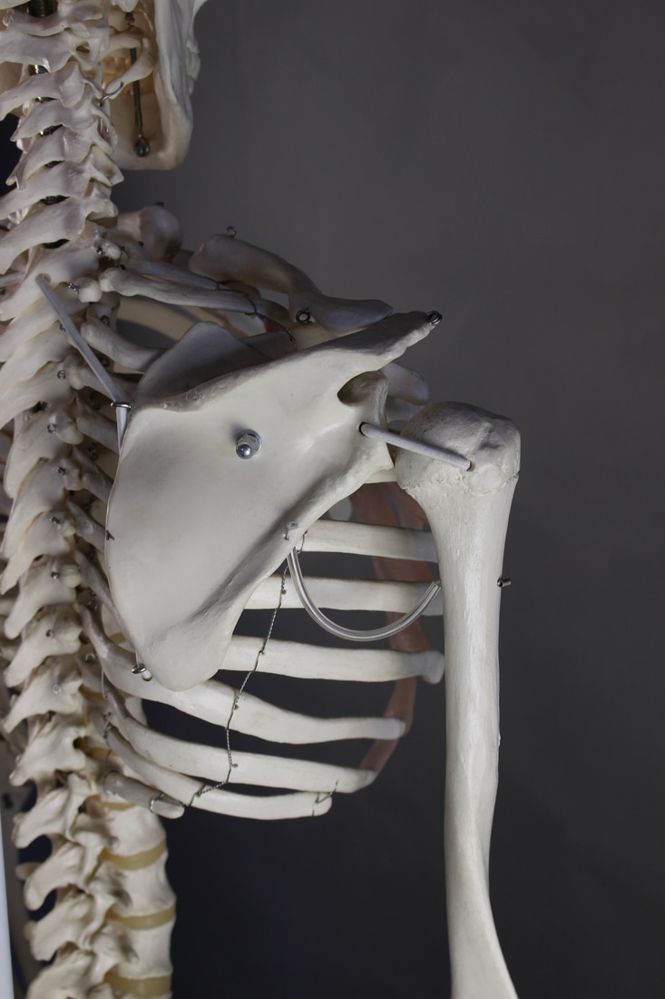
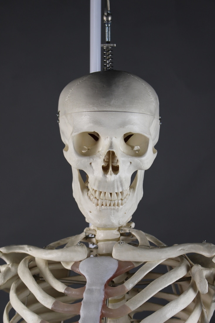
structure of the body
The aim of this task is to explore the structure of the many different layers and parts of the body, such as muscles veins and especially the skeleton.
Peter hickly
|
|
|
In his piece complex series Peter Hickley creates an array of hand printed cyanotypes on watercolour paper and them hand stitched thread that represents the different muscle structures of the body.
|
|
|
|
|
|
Structure of the skeleton
exhibition visit 1 the radical eye
I visited the Tate modern to go to the Sir Elton Johns personal photography collection. It features many works from photographers such as Man Ray with his portrait collections and Matisse and Picasso. Here are a few of My favourites.
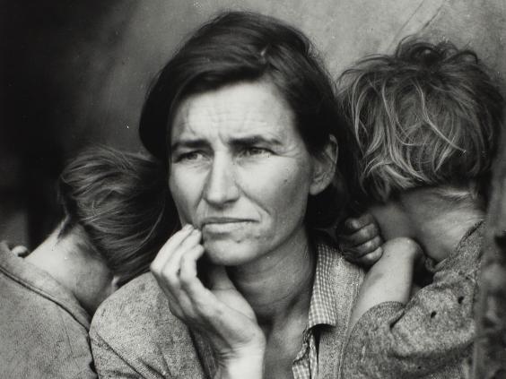
Dorothea Lang 1895-1965
Migrant Mother 1936 I like this one as the direction the mother is looking in is different to where her children are looking. This shows the contrasting mindsets of the subjects, with her kids possibly looking back to the past and her looking, although sceptical, forward into the future. |
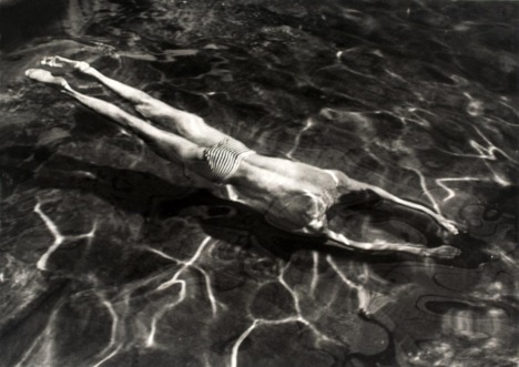
André Kertész 1894-1985
Underwater swimmer 1917 The picture is very dark and the only visible parts are in the light. This makes the swimmer and the lines of reflected sun light the pinnacle focus. |
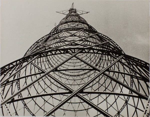
Alexandr Rodchenko 1891-1956
Shukov Tower 1920 I like this one especially like this one as it links to our theme of structure, the tower is very symmetrical and the tower creates these interesting geometrical shapes. 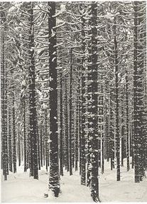
Albert Renger-Patzsch 1897-1966
Mountain Forest in Winter 1926 The snow on all the branches of the trees make it look very beautiful, picturesque and natural. |
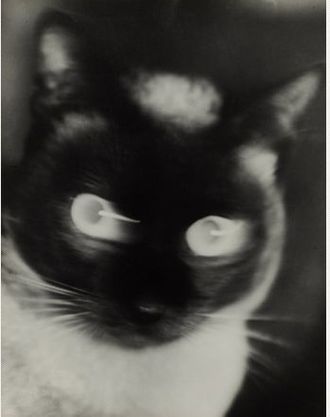
Otto Umbehr 1902-1980
Katz 1927 The close up of this cat is interesting as the eyes are blurred and stand out because its face is a dark colour. The cat also seems to be looking straight at the viewer. |
tate modern contact sheet
exhibition visit 2 wolfgang tillmans
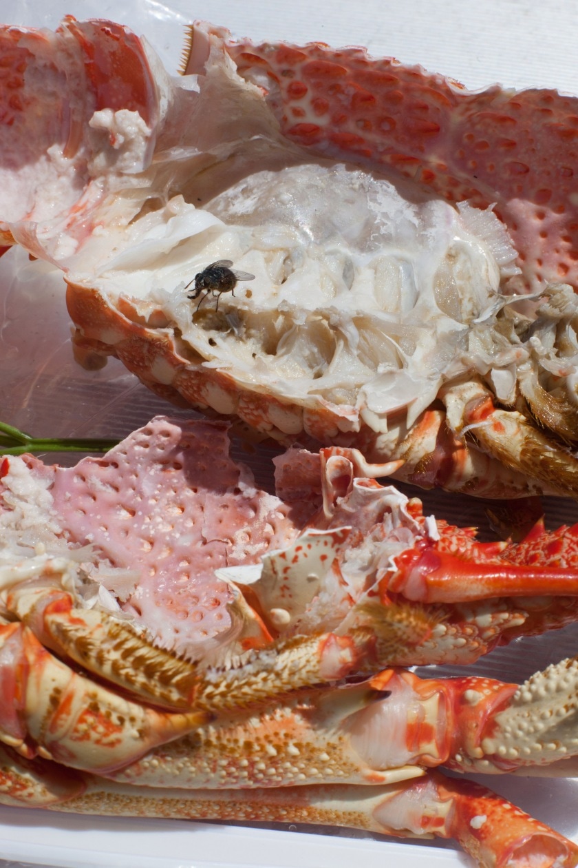
astro crusto 2012
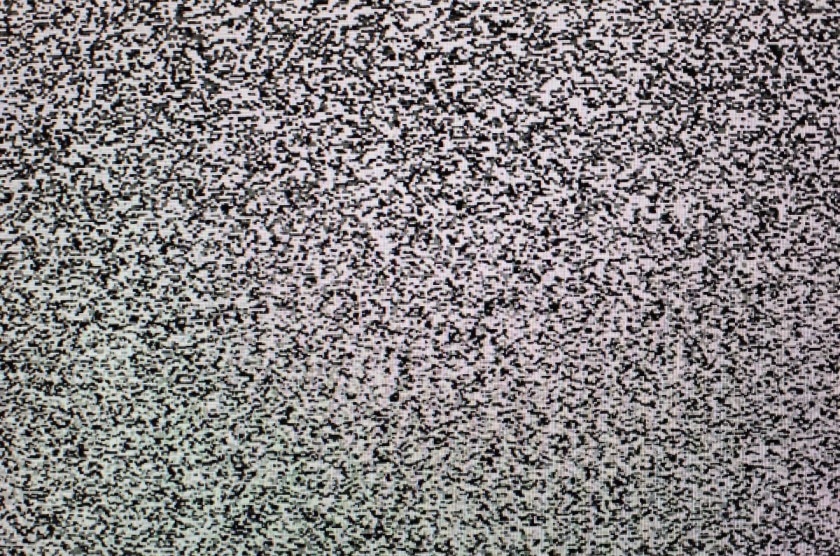
Sendeschluss/End of Broadcast 2014
|
La Palma 2014
Greifbar 29 2014
|
3 strands
first strand geometric shapes and nature
Inspiration:
http://blog.spoongraphics.co.uk/tutorials/how-to-create-abstract-geometric-photo-collage-art
http://www.jellemartens.be/script.html
http://www.jellemartens.be/index.html
http://habit-of-art.blogspot.co.uk/2011/03/artists-i-like-jelle-martens.html
https://www.lensculture.com/articles/agnieszka-sosnowska-in-my-backyard-iceland
John Kippin
Brian Alfred
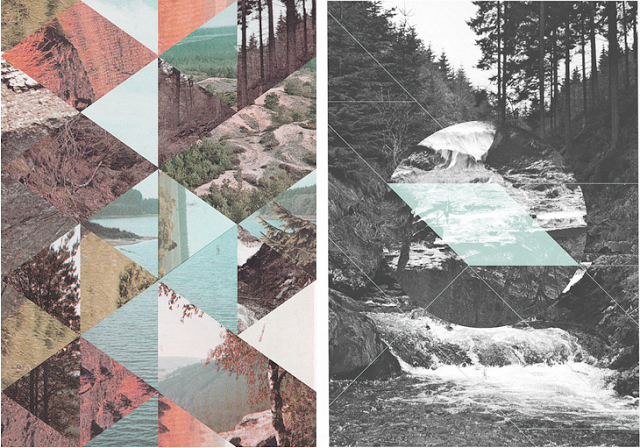
Mountainous areas
final image
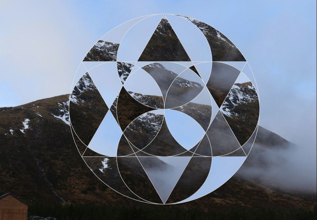
WWW
The lighting and colour of the picture to start with is a nice tone. The editing is very neat and tidy and the composition of images is random yet not illogical.
EBI
I think the image could benefit from some further editing for example changing the brightness and contrast.
The lighting and colour of the picture to start with is a nice tone. The editing is very neat and tidy and the composition of images is random yet not illogical.
EBI
I think the image could benefit from some further editing for example changing the brightness and contrast.
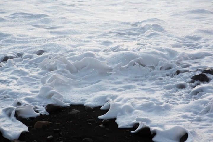
coastal areas
final image
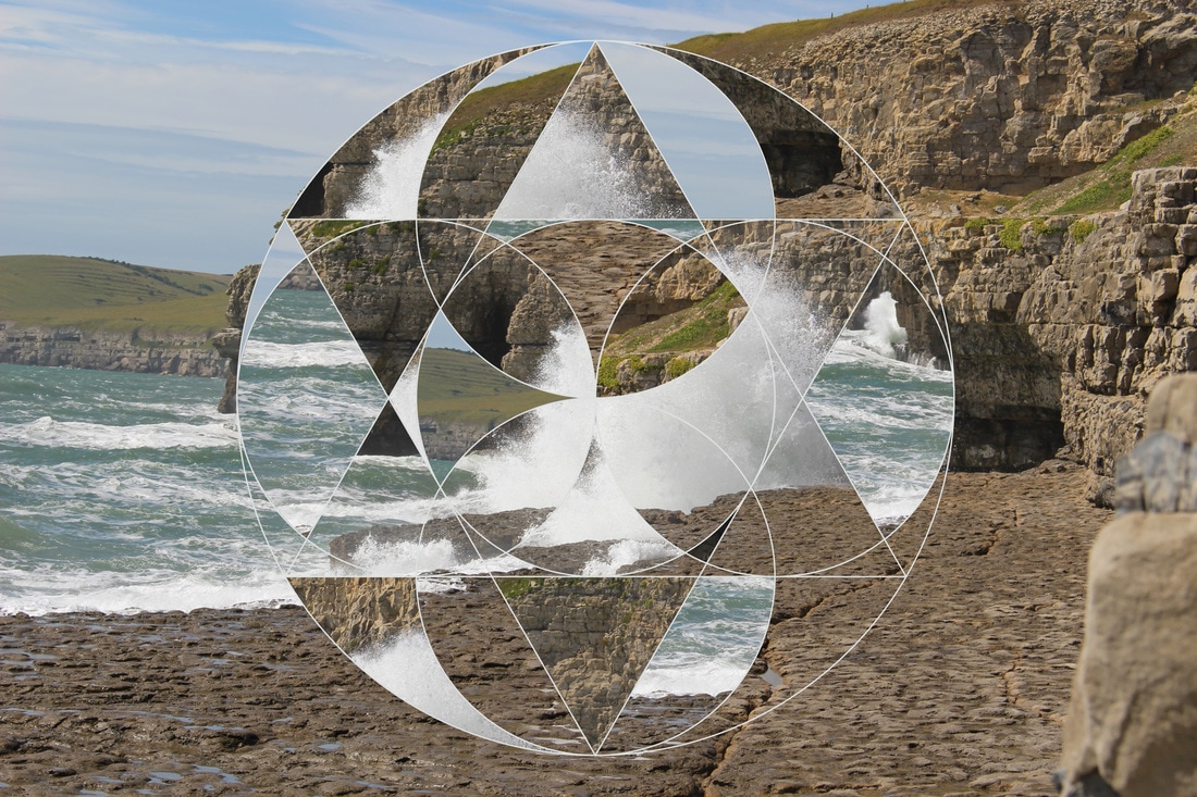
WWW
I decided not to fill in all of the geometric shapes as I thought the wight water looked good and made the image move and not look so stationary.
EBI
This also needs a bit of further edition, maybe changing the filter adding grain or something similar.
I decided not to fill in all of the geometric shapes as I thought the wight water looked good and made the image move and not look so stationary.
EBI
This also needs a bit of further edition, maybe changing the filter adding grain or something similar.
The pictures I used Individually were all good however when they are combined I don't think they work well together. The geometric shape isn't very interesting as all the shapes created are the same.
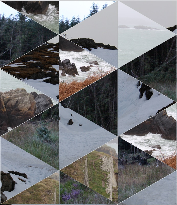
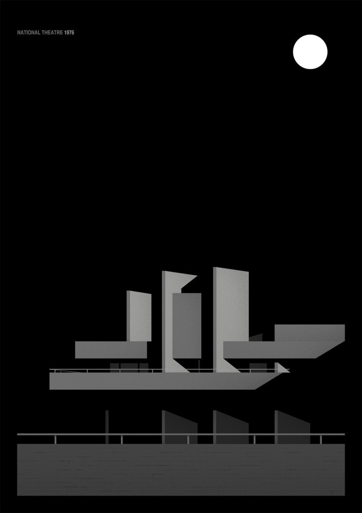
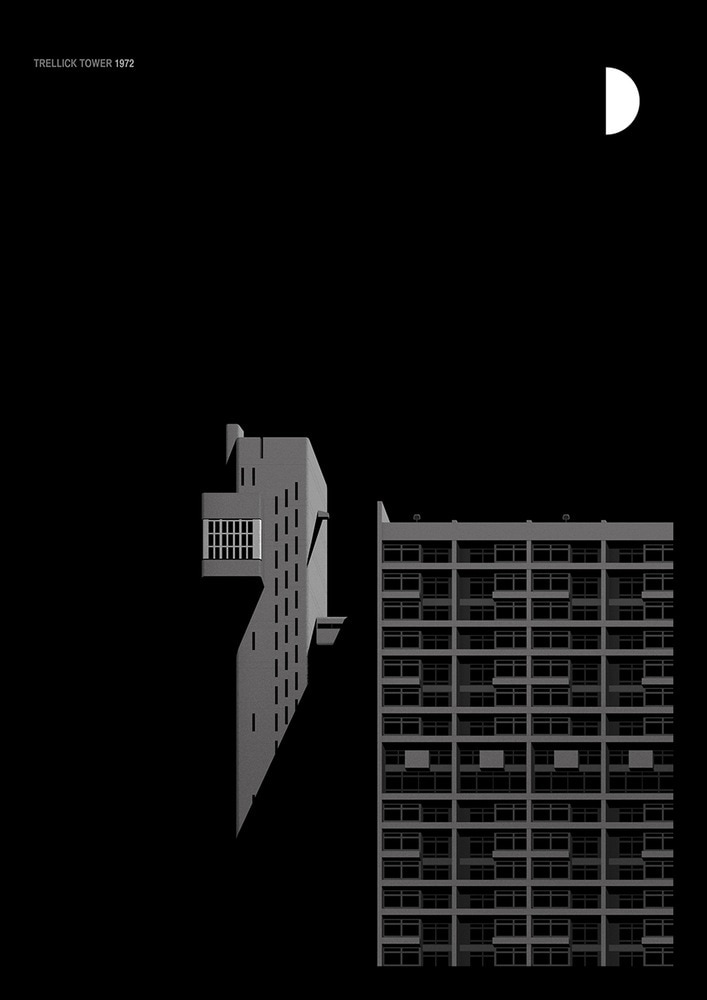
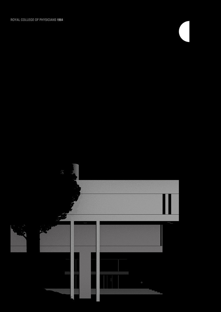
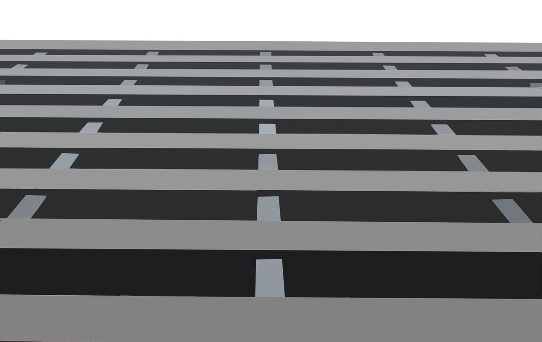
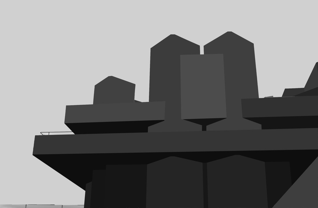
strand 2 SIMPLIFIED structure of architecture
Thomas Danthony
|
|
|
Thomas Danthony takes pictures of brutalist styled buildings and then simplifies them down to their block colours.
My RESPONSE
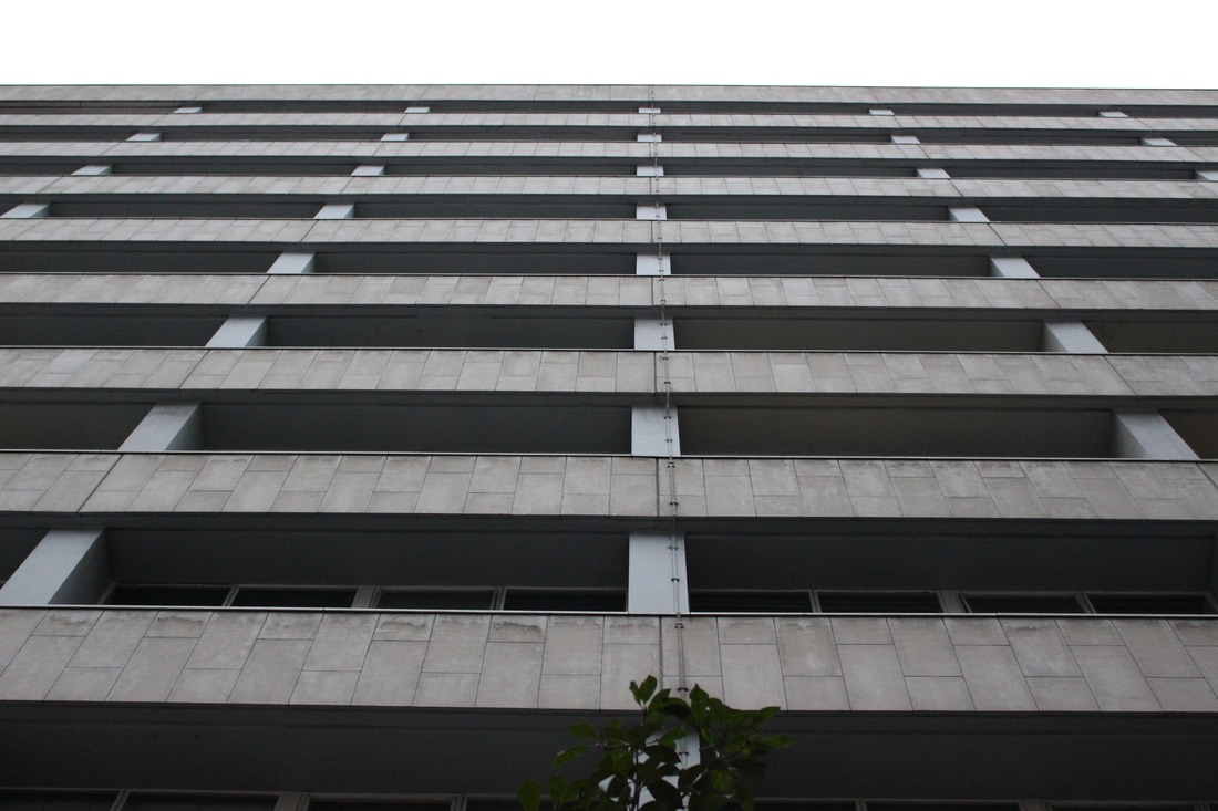
WWW
It looks very neat and has a lot of straight lines at right angles.
EBI
However the building featured isn't all that interesting and with only 3 shades of grey, it looks bland and uninspiring. I think I would choose a different building Next time with a less dull deign with plenty of contrast.
It looks very neat and has a lot of straight lines at right angles.
EBI
However the building featured isn't all that interesting and with only 3 shades of grey, it looks bland and uninspiring. I think I would choose a different building Next time with a less dull deign with plenty of contrast.
WWW
There is a much more interesting composition of colour as there are quite a few different shades.
EBI
There are a few rough bits in the picture which I would tidy up for example the mid right and bottom left.
There is a much more interesting composition of colour as there are quite a few different shades.
EBI
There are a few rough bits in the picture which I would tidy up for example the mid right and bottom left.
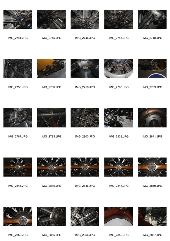
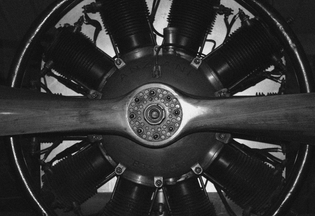
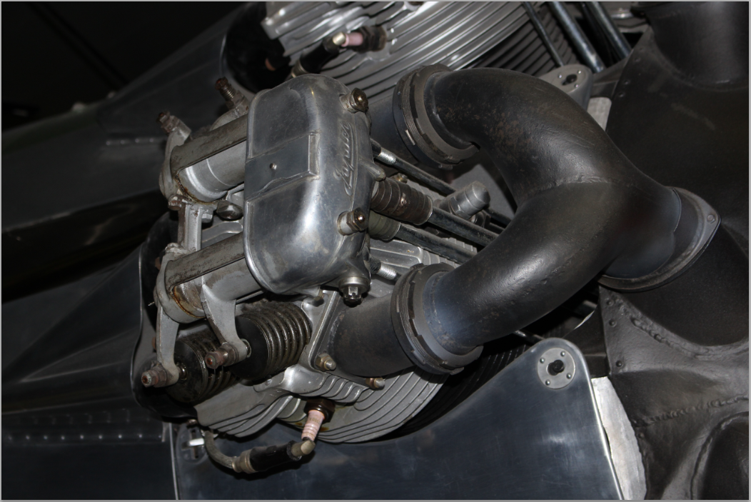
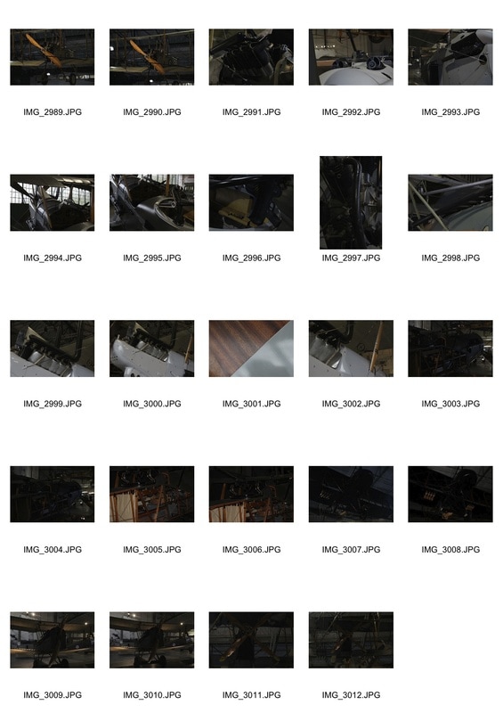
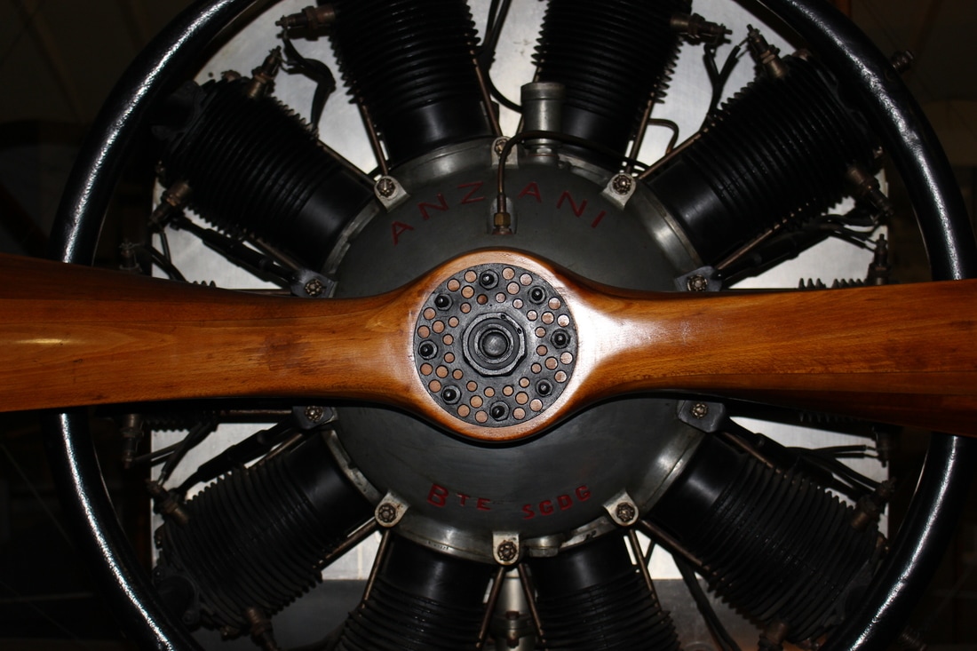
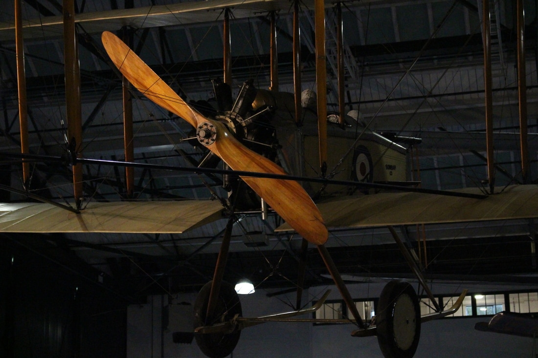
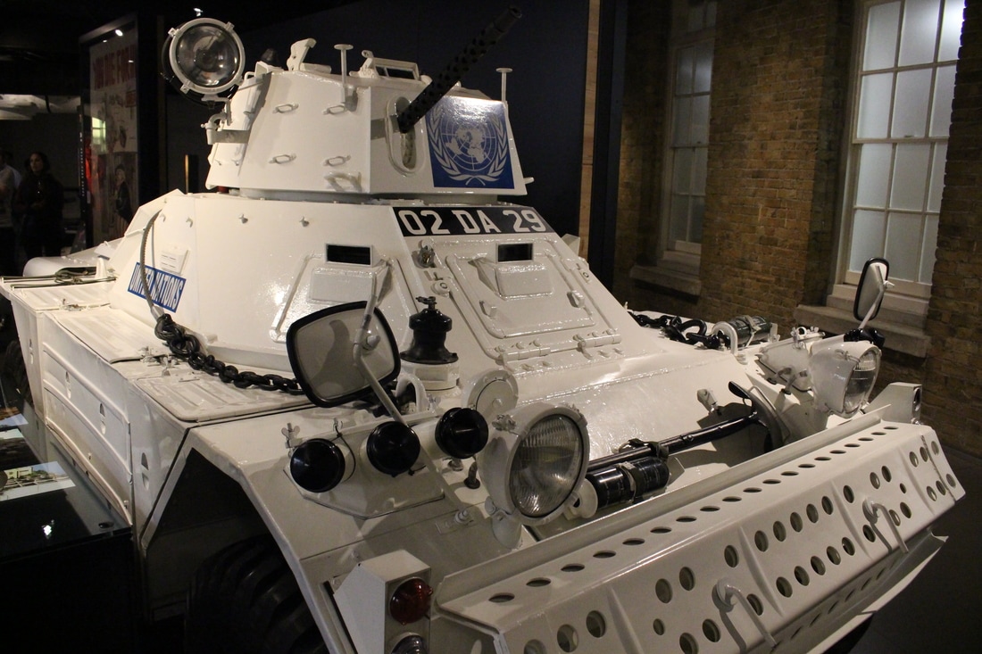
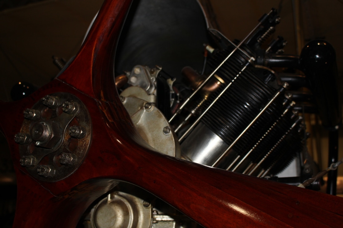
Strand 3 structures of MACHINERY
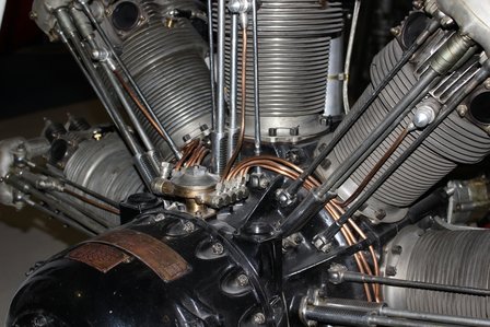
Inspired by Jeffrey Milstein
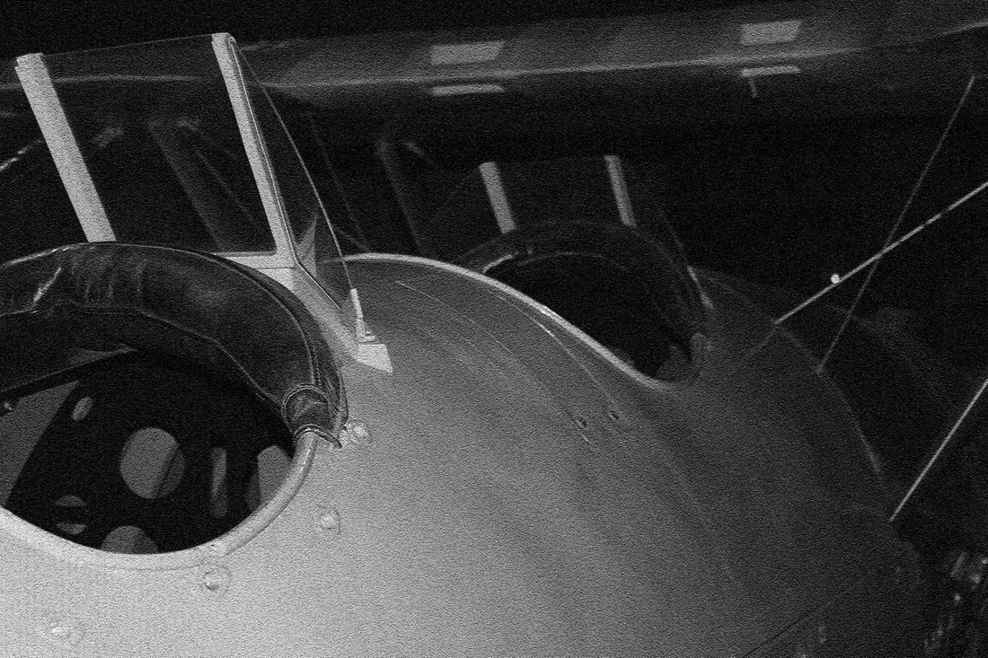
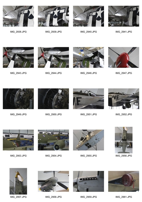
For this strand I will be focusing on the structure of machinery especially planes and engines. This links with the general theme of structure heavily as engines and planes have very complex design as aerodynamics are a vital consideration in a planes design. As well as that engines have many structural features to make them perform to the max, for example the fins which increase the surface area aiding cooling.

|
|
|
|
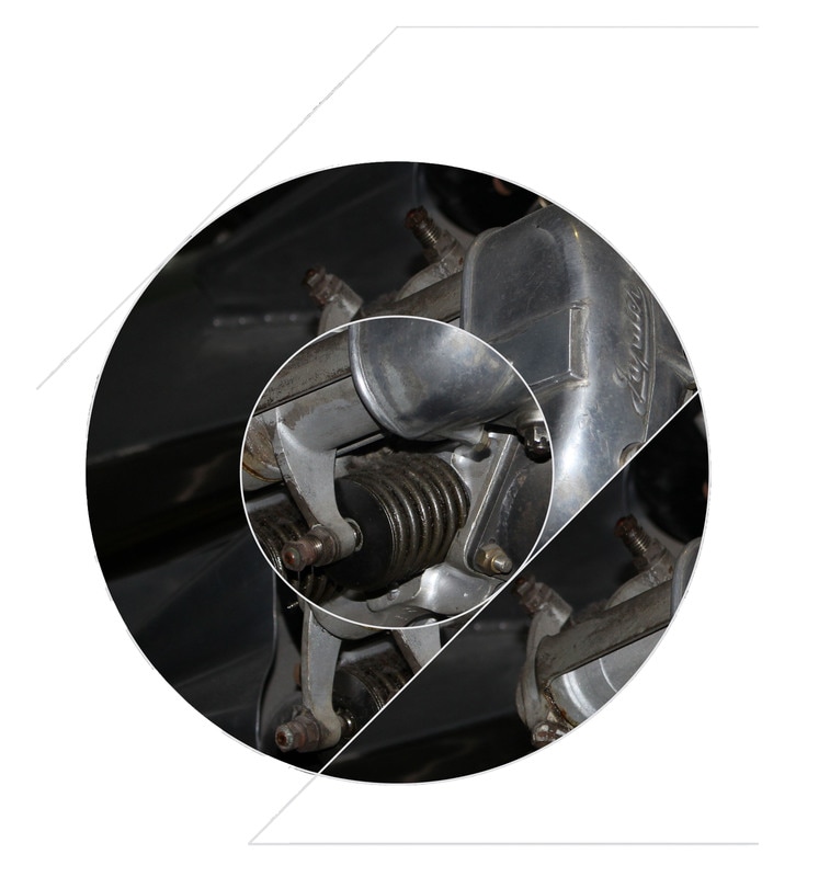
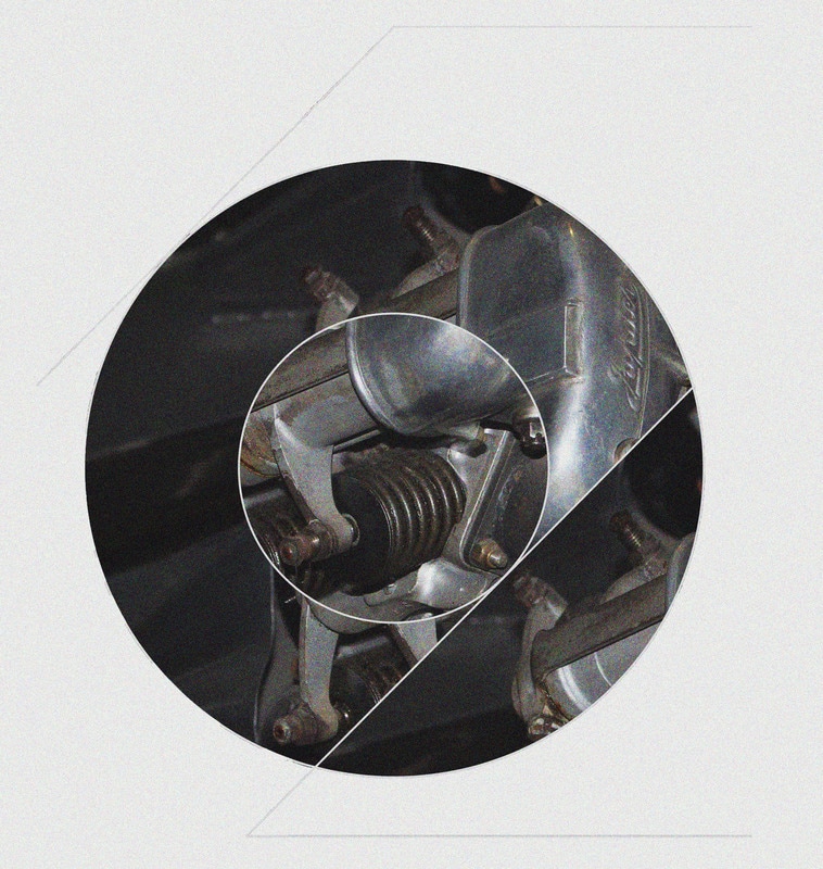
Final piece: structures of air force machinery and associated symbols
I am aiming to combine strand 1 and strand 3, taking the photos from the RAF museum and technique of making the symbol and the composition of the cut pictures inside the shape.
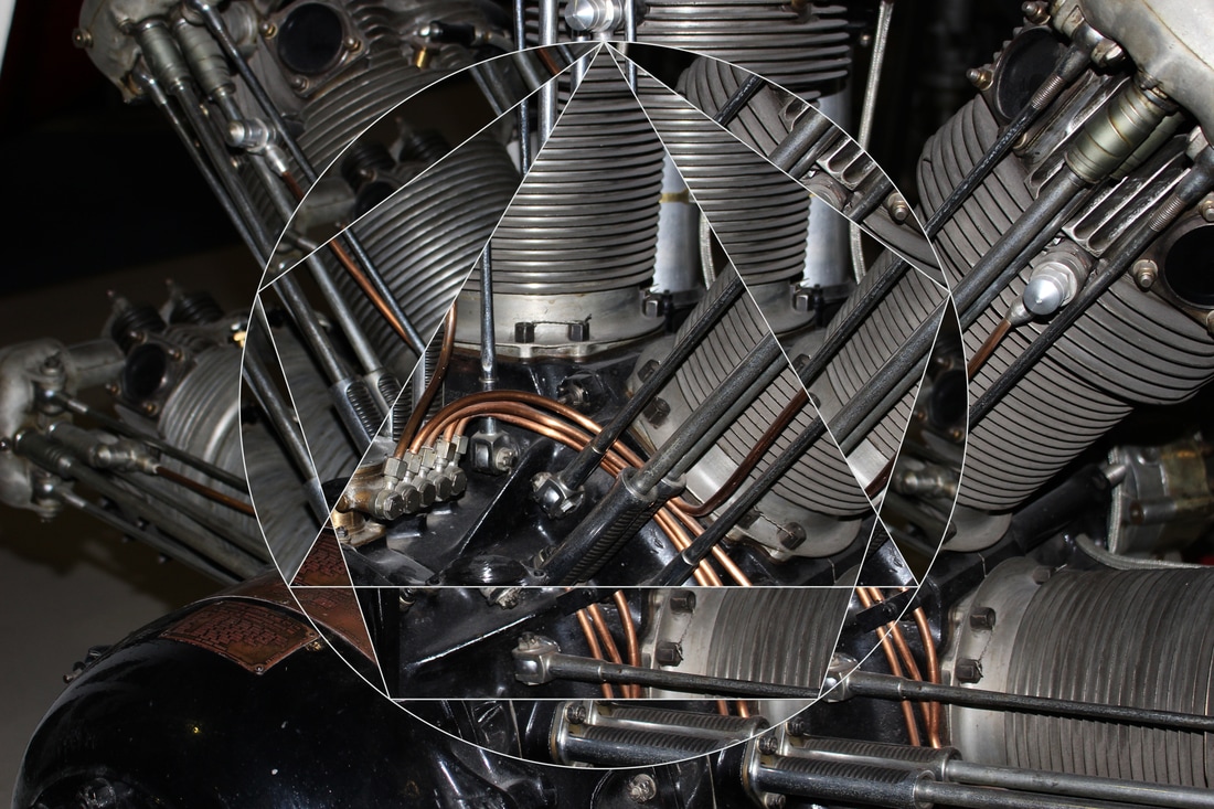
development 1
|
|
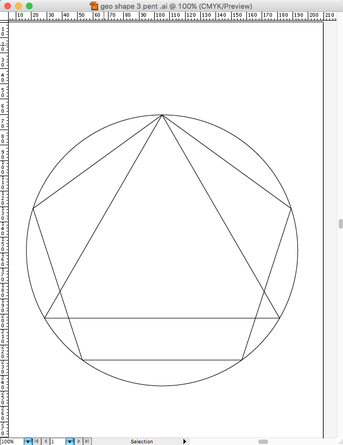
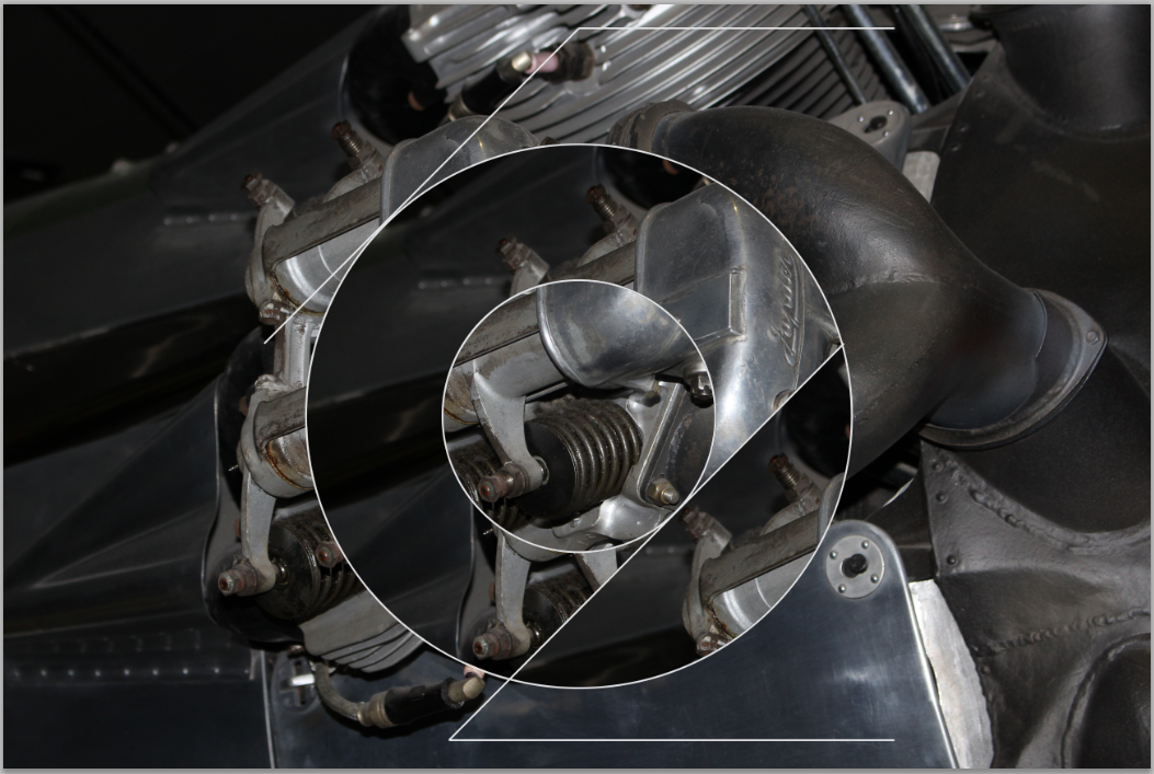
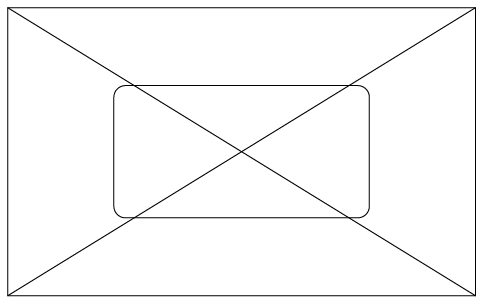
First I created the geometric shapes on Illustrator using the ellipse and polygon tools. I then copied it across to the photoshop page and using the magic wand tool i highlighted the areas split up by the shapes, moved the box on to a part of the picture i wanted to copy. I would click on the background layer then copy and then place back.
development 2
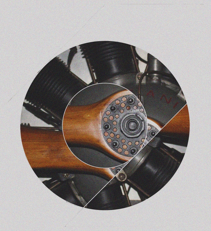
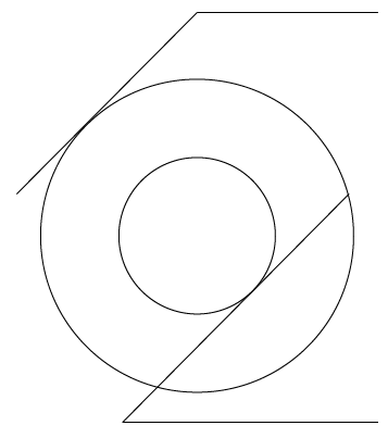
In this development I will try and make connections between the symbol and the photo as in strand one the connection is very vague. I chose the RAF roundel which is very recognisable and iconic of British planes such as the Spitfire and much older ones.
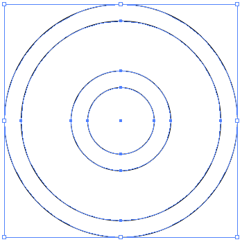
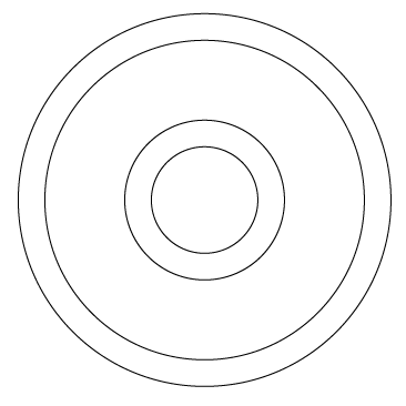
The first thing i did was create the RAF emblem so I researched it on google images to see which circles where bigger and which were smaller. Then I drew circle of size: 300px, 250px, 150px and 100px on illustrator.
|
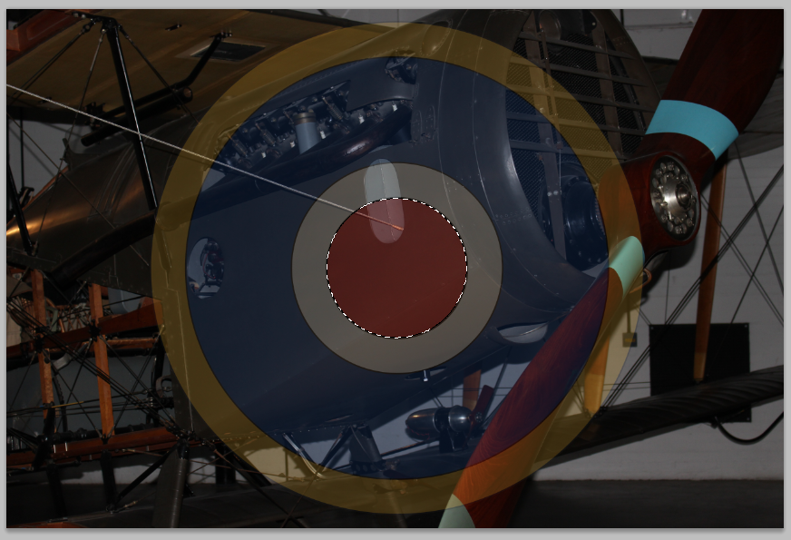
I then selected all of the circles and copied across to the picture of the plane. I then chose the paint bucket tool and filled the circles with the designated colours.
|
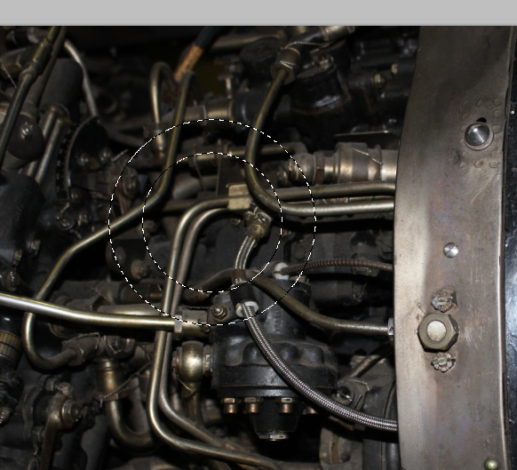
I uploaded other images to photoshop and copied areas across then pasted them onto the background in the circles.
|
|
The final step was to add the craquelure filter to add texture, as seen in the picture above.
|
|
second responce
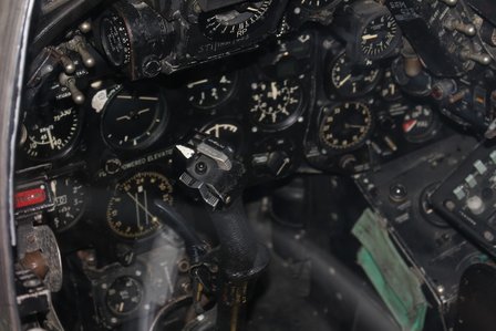
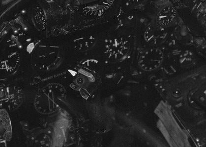
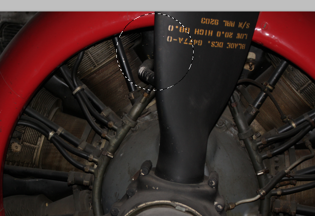
I went to the imperial war museum and took a picture of this very Iconic plane model the Lancaster Bomber.
WWW:
I think the edges look good as jaged and not smooth as it gives the picture texture, i think it also makes it look like a badge.
EBI:
I think I would change the grain and the lighting as it is very similar to my first response.
I think the edges look good as jaged and not smooth as it gives the picture texture, i think it also makes it look like a badge.
EBI:
I think I would change the grain and the lighting as it is very similar to my first response.
development 3
My aim for this development is to further connect and link the photo to the symbol.
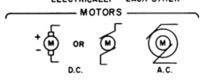
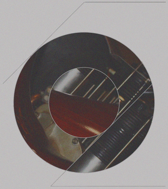
First of all I typed up aviation symbols into google and chose the symbol for motor which came up. I then used a picture of an engine to abstract and combine with this symbol. I used illustrator to make the shape and then copied and pasted it across to photoshop. I thought the contrast of the motor symbol and the real thing would be interesting.
|
|
|
|
|
As a second response I added grain and changed the saturation to +45 as you can see on the right.
Development 4
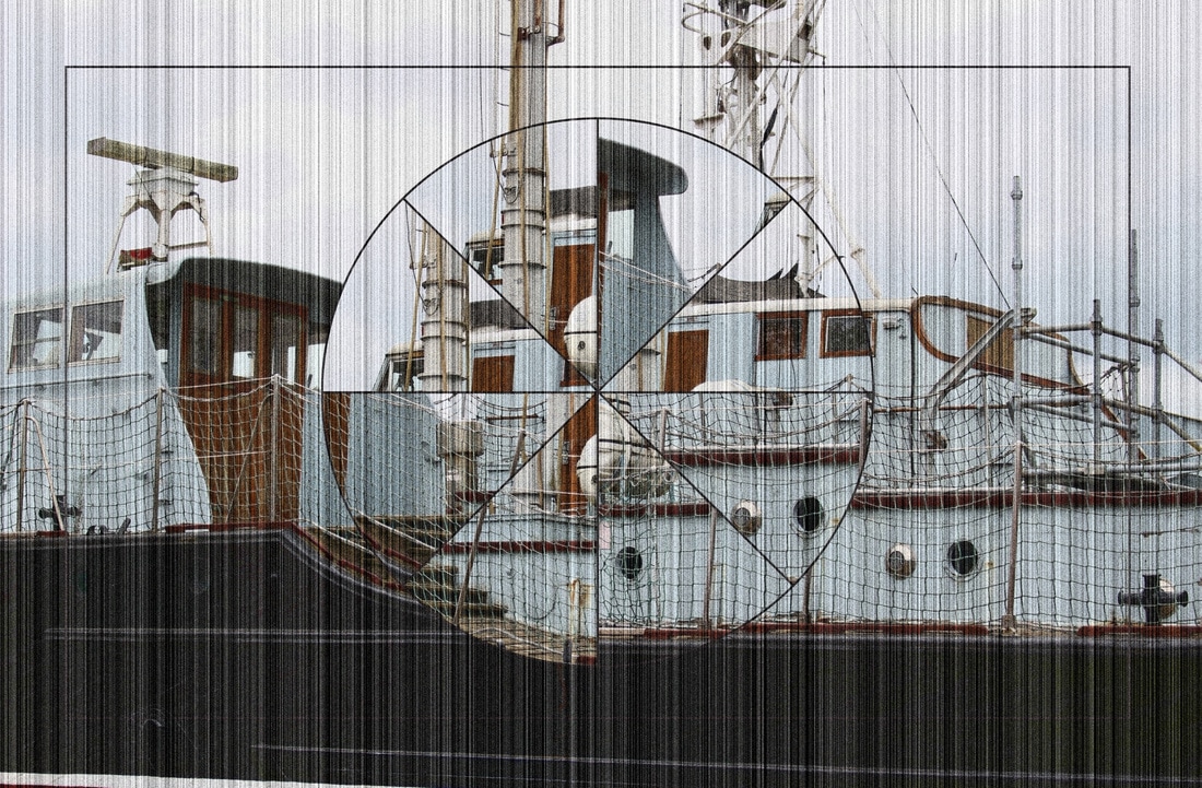
This development follows a contact sheet of two pilot boats which are outside the RAF museum.
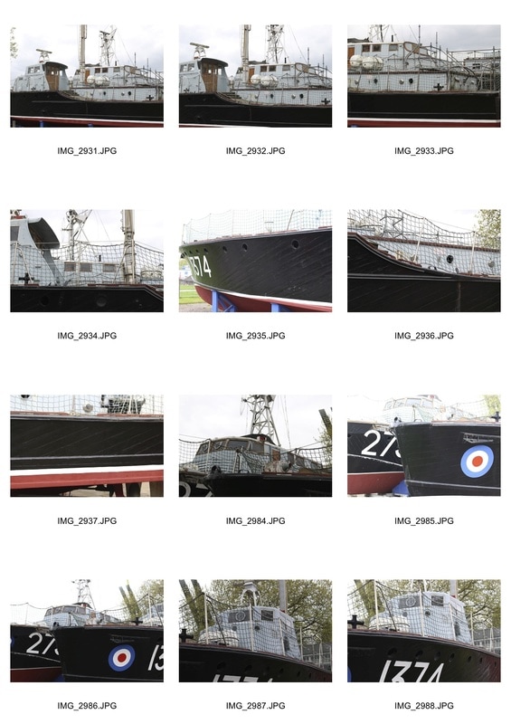
These are a collection of symbols which I found on google images from which i have chosen the appropriate ones.
WWW:
I like how the light blue wood and Brown wood provide contrast as it is a good colour combination. I also like how the circular middle resembles a ships wheel.
EBI: I could edit the photo more for example add some grain or crop the sides or only have the middle circle.
I like how the light blue wood and Brown wood provide contrast as it is a good colour combination. I also like how the circular middle resembles a ships wheel.
EBI: I could edit the photo more for example add some grain or crop the sides or only have the middle circle.
Final Piece
Final Piece plan:
Have different pieces with associated symbols including: RAF roundel, Transport, Armoured Infantry and the motor A.C. symbols.
Have different pieces with associated symbols including: RAF roundel, Transport, Armoured Infantry and the motor A.C. symbols.
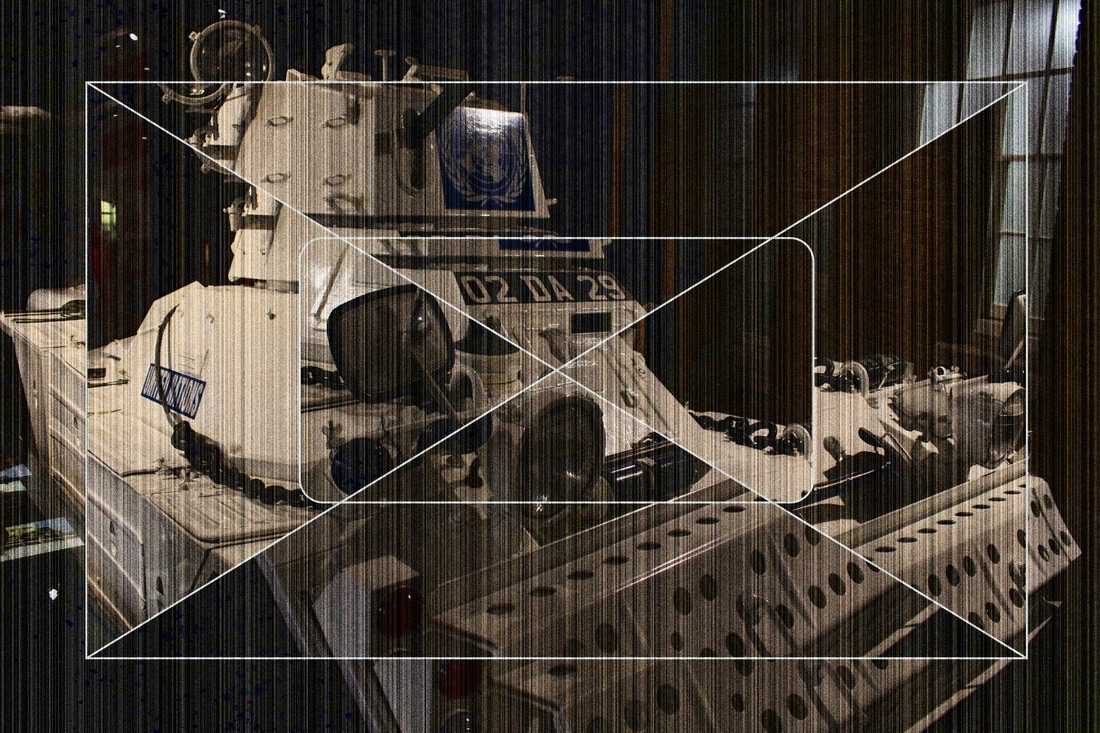
Armoured Infantry
Motor A.C.
|
Transport
|
RAF roundel
|
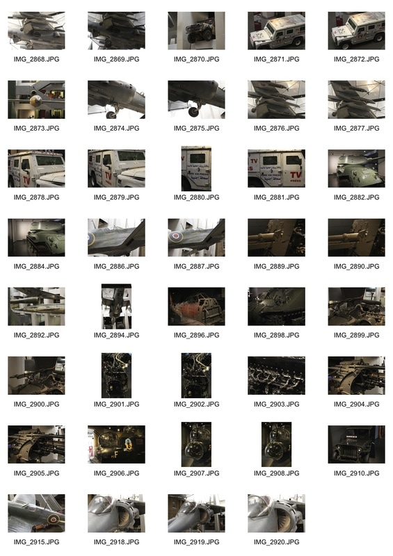
Pictures i'm going to use
|
|
|
|
Final pieces