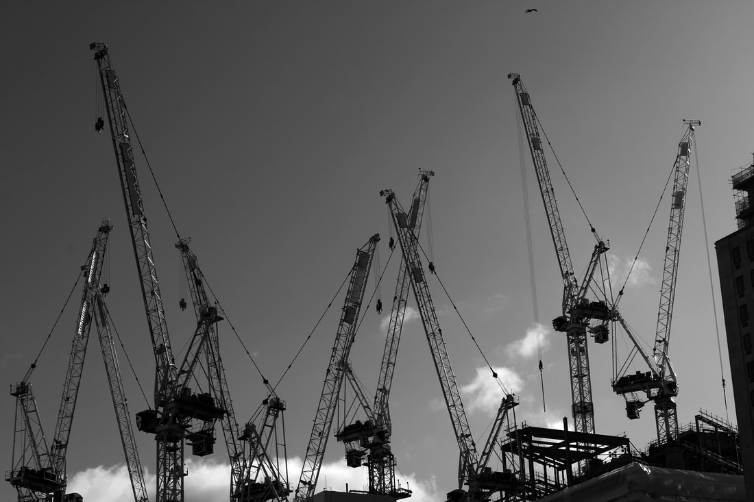
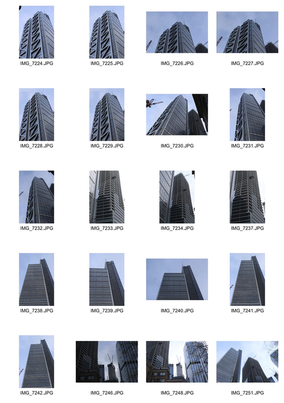
Lighting workshop
For this task we experimented with using different types of light in portraiture, they included: soft studio lighting, harsh studio lighting and natural light. I used the light to manipulate my subject and form shadows to change the effect of the portrait on the viewer.
Soft studio lighting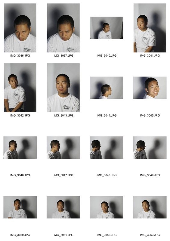
Natural light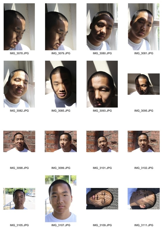
|
Harsh studio Lighting Tungsten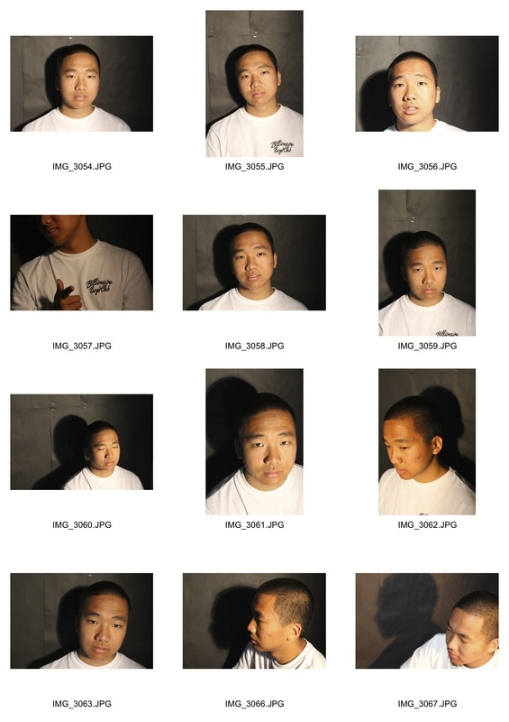
final pieces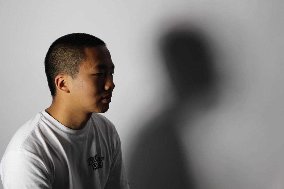
WWW
By positioning the studio light behind him I manage to create an interesting shadow on the backdrop which doesn't resemble the subject. The picture is effective as it confuses and captures the viewers attention. EBI Next time I might experiment with changing the shape of the shadow and distorting its shape to exaggerate the sense of mystery . |
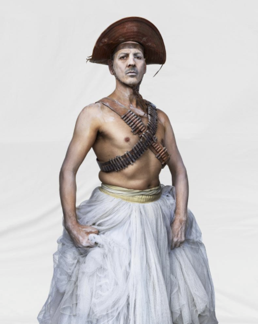
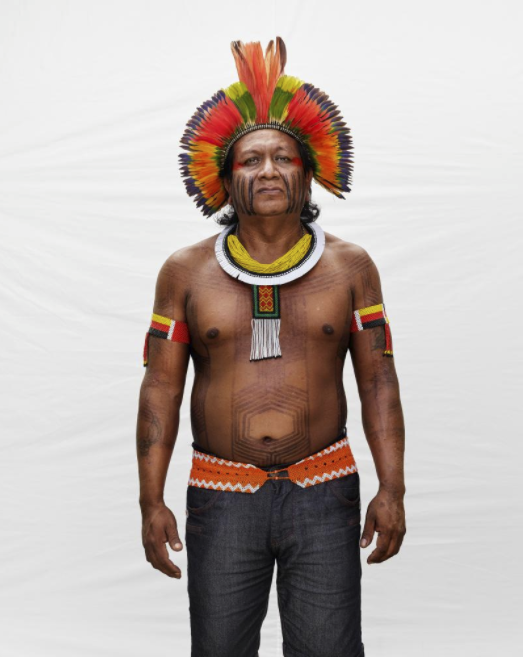
somos brazil: marcus lyon
|
|
|
This is a multimedia project and book which features diverse people from all over Brazil. Marcus Lyon spent 6 months exploring some of the most diverse parts of Brazil to create this project where he looks at Brazilian identity. During his trip he took high quality portraits (using a white sheet as a background), recorded soundscapes and mapped the ancestral DNA of over 100 Brazilians.
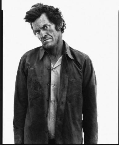
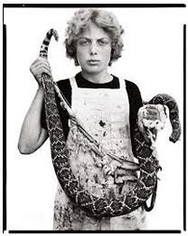
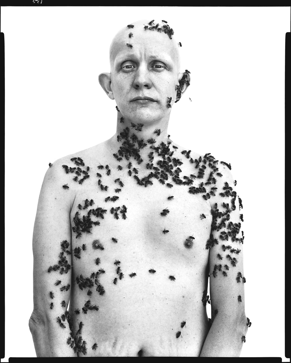
In the AMERICAn midwest: richard avedon
This work was commissioned by the Amon Carter Museum of Art in Fort Worth, Texas in 1979. It features a collection of portraits of Texans.
|
|
|
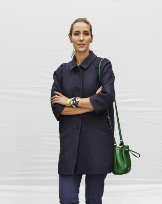
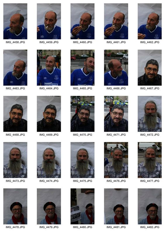
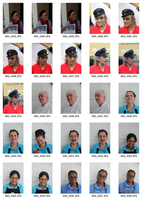
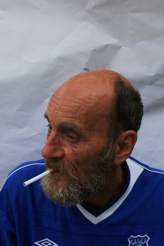
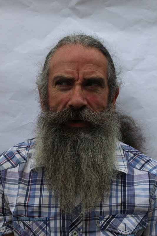
In north london
Using a white piece of paper as a back ground I went round Muswell Hill to take portraits of interesting people I found. The white paper isolates the subject and takes away the context, focusing just on the subject.
|
|
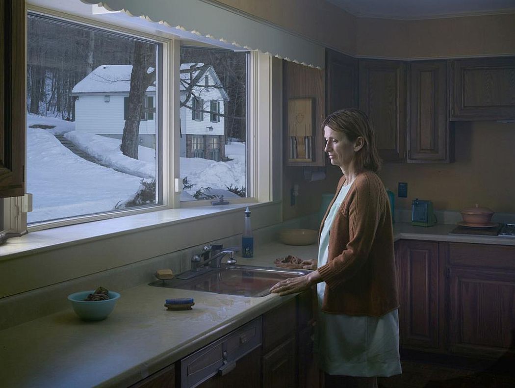
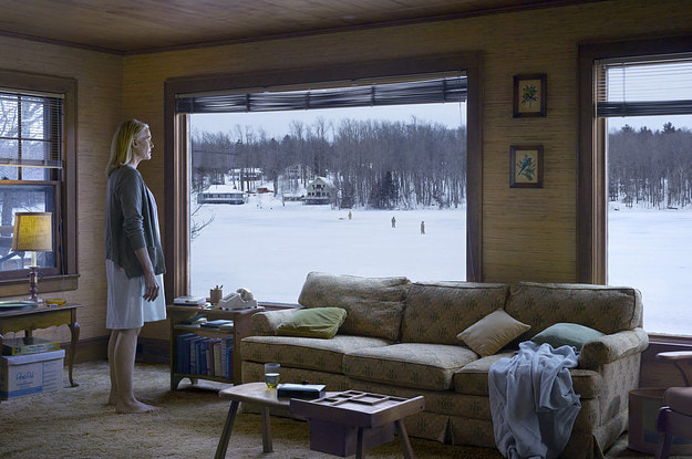
exhibition visit- gregory crewdson: cathedral of the pines
|
|
Crewdson's work really captivates me as he installs a sense of mystery in each of his picture as there is always something going on. If u look closely at the picture on the top left for example you will notice that the sink is full with blood diluted in water and the rags and hand brush are stained red. The woman looks down contemplating something that is not obvious to the viewer but one can vividly imagine what might have happened before this scene. The bottom right picture features a woman staring of into the distance while in the background there are people walking around on the frozen lake, maybe looking for something or someone.
practical responses - starting points
The aim of these responses is to get back in to photography and undertake a series of practical briefs that may inspire my own visual practise.
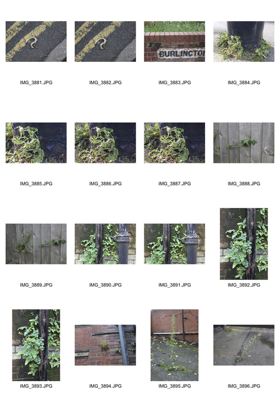
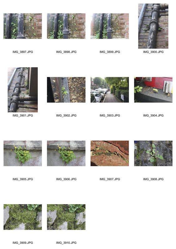
artist and me: catherine christofis
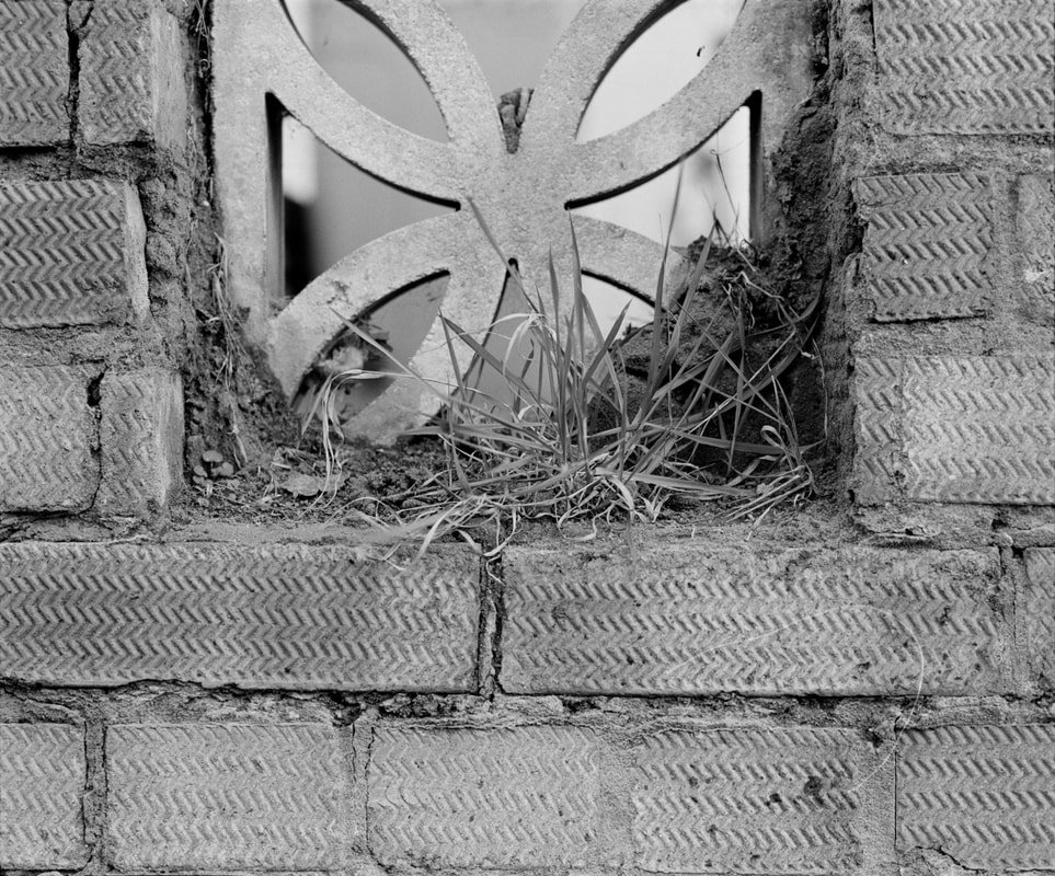
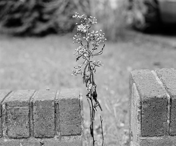
In this series Catherine Christofis aims to show weeds, that are usually seen as a nuisance and ugly, as beautiful in their own right. Christofis is also fascinated by nature breaking through the man made world, she travelled along the A406 to create this selection of photographs.
|
|
|
My response
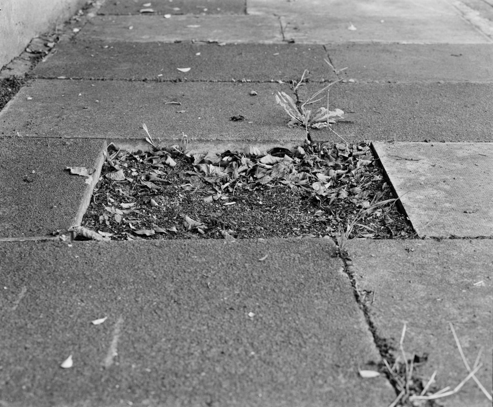
I walked around Muswell hill looking into overgrown front gardens, in the composition I aimed to contrast something man made like a brick or a pipe with a plant specifically a weed. This is linked to my curator ship task since I look at how man has influenced nature however what I am exploring here is how nature has fought back and how it is influencing man-made structures on a small scale.
|
|
I learned that to get the best results and to show nature taking over man-made structures effectively it was important to get up close to the subject and use the macro setting on the camera. By doing this I got a high definition photo which clearly shoes nature, in this case plants, invading a structure for example a brick wall.
artist and me: jurgen schrepfer
|
|
|
Jurgen Schrepfer is a self-taught amateur photographer who explores the urban scenery and modern architecture of Frankfurt and other cities.
|
|
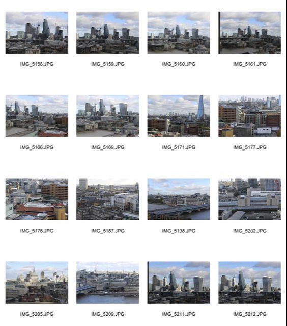
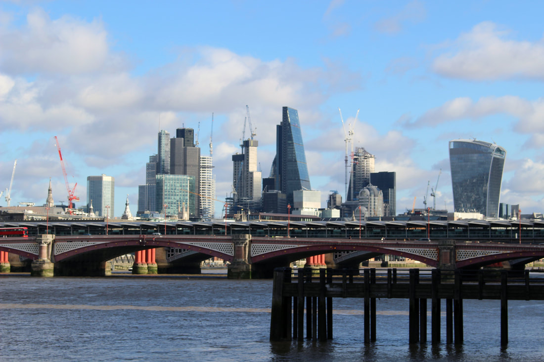
brief: An exploration of issues relevant to London at this time.
London is a big city, it is the third biggest city in Europe and has a population of 8.788 million. It is a globally significant city as it was rated the second most economically powerful city in the world, just after New York. London is also one of the most multicultural cities in the world with one third of Londoners being foreign born and over 200 languages being spoken. This partly explains why London is such a globalised city.
In 2008 there was a global financial crisis and the UK went into a recession. This was caused by banks that were able to create too much money, too quickly and used it to push up housing prices and speculate on the financial market. It was because of this that 8.8 million Americans lost their jobs and Lehman Brothers, the fourth largest investment bank at the time, collapsed.
My aim is to show the issues London is facing today, this will include overpopulation and the corruption of the corporate world which includes banks and Multi-National Corporations. I will look at London's population and London's buildings that are home to the banking and trade sector.
development 1
Possible starting points:
-Population, Oxford street, public transport, Liverpool St. Using long exposures like photographer Alexey Titarenko.
-Where the homeless sleep, back alleys with cardboard and sleeping bags.
-Grenfell tower.
-Population, Oxford street, public transport, Liverpool St. Using long exposures like photographer Alexey Titarenko.
-Where the homeless sleep, back alleys with cardboard and sleeping bags.
-Grenfell tower.
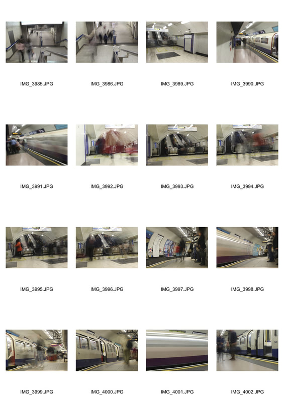
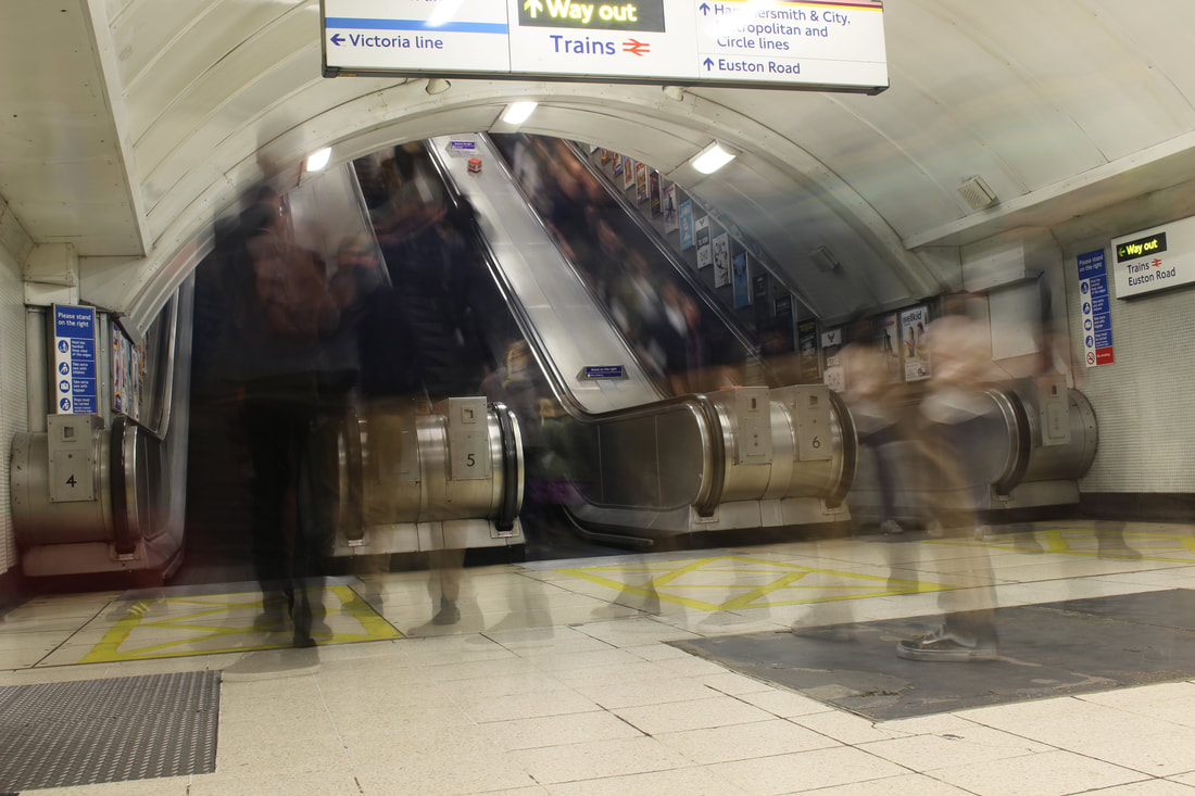
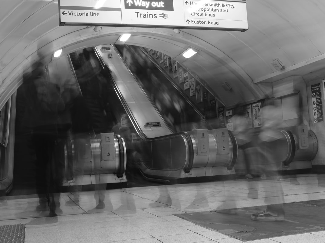
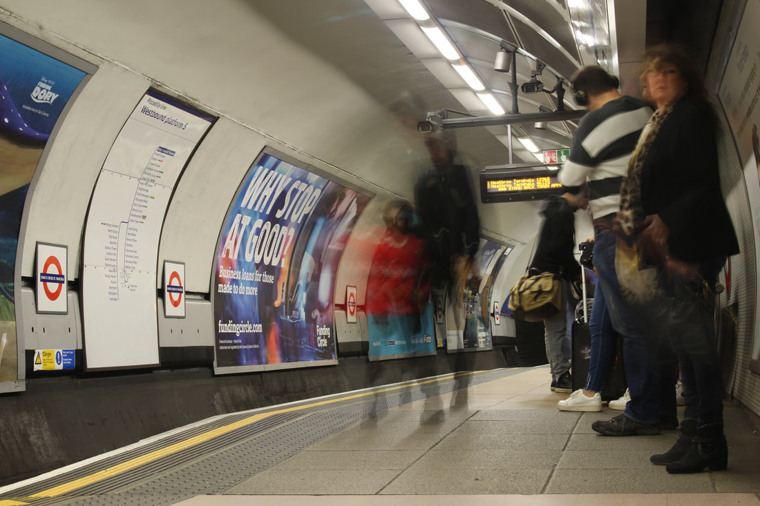
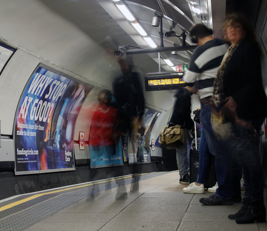
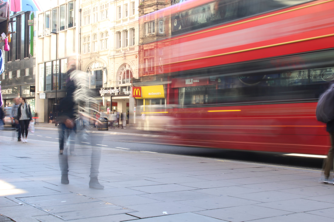
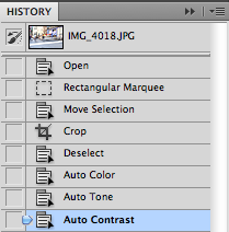
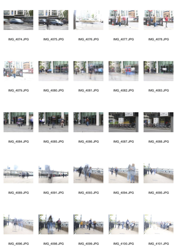
For the following images I used a tripod and set my camera in the Tv mode which is otherwise know as shutter priority, this enables me to change the shutter speed and then the camera changes the aperture and ISO automatically. I set the shutter speed to 1.6 seconds or 2 seconds if my subjects were moving slowly.
WWW
The people look more like shadows as they don't have an outline like the other picture. This is either because they are moving faster or I used 2 seconds for the shutter speed. EBI I think if the people in the foreground were a bit more pronounced the picture would look less empty as it is only if you look close do you see the people. |
WWW
The girls red jumper stands out especially since it is such a vibrant colour. I also like how the mans ghostly head is floating just above the real body. EBI The people on the right of the picture stood still when I took the picture so they don't seem to be blurry. If I would do it again I would set up a picture where everyone is moving so everyone looks like a shadow. |
development 2
WWW
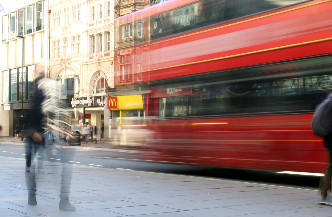
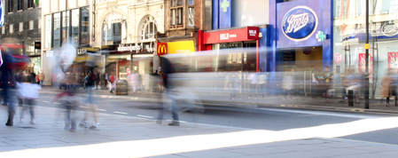
The bus looks really good as because of the effect you can't see the wheel or the wheel arches on the bus, this gives the impression that the bus is floating making the picture look really futuristic. This could represent how much transportation has improved in the last 50 years, and the fact that its blurry and moving could show how technology is still growing and developing. EBI I think I would choose another angle or area as the buildings in the top left of the picture are quite bland and boring, this makes the image look quite dull. Next time I would find parade of shops with more interesting buildings and bright shop fronts. |
WWW
The white van and the person next to it are traveling across the picture from right to left. In street photography often the surroundings are blurred out and the people are the ones in focus, however with these the big brand shops are the only thing in focus. This shows the everlasting mark of consumer brands on the population and the environment. EBI Apart from Mcdonalds the shops aren't necessarily known for having damaging impacts on the world. To portray my point better I would try find a series of shops that are known for their damaging environmental and social impacts for the world. For example Primark, Coca Cola and BP petrol. |
development 3
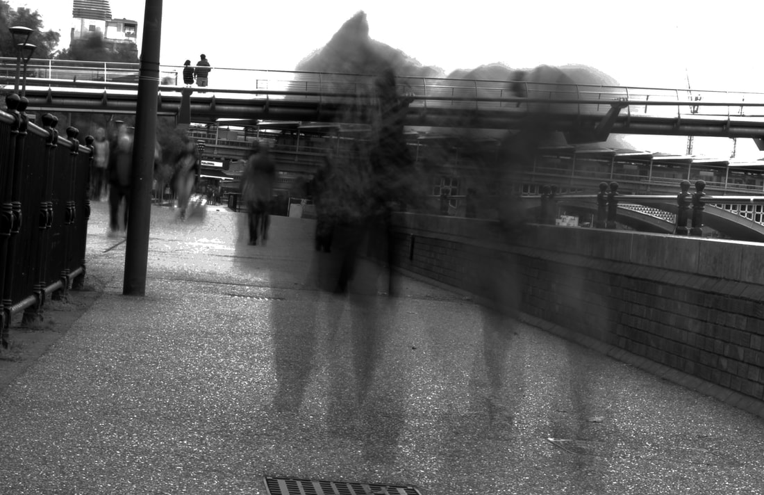
London Rush hour
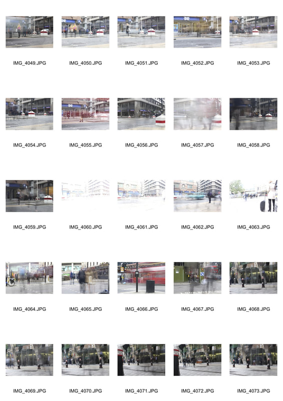
I went to Moorgate tube station and then walked around the area setting up my tripod and camera to capture long exposures of people during rush hour.
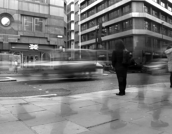
WWW
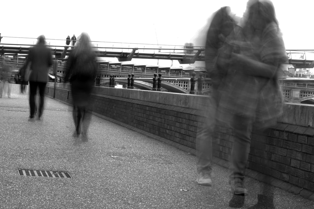
This picture works really well as the woman stood still while I took the picture while everyone else just walked on.
The picture is effective as it seems that as she is standing thinking, the rest of London is rushing past her oblivious to her and everyone else as if she is the only one really there.
EBI
The bodies of the people walking past are not pronounced very well apart from the feet and lower legs, next time I would experiment with using a faster shutter speed so they are seen much clearer.
|
|
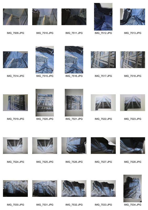
development 4
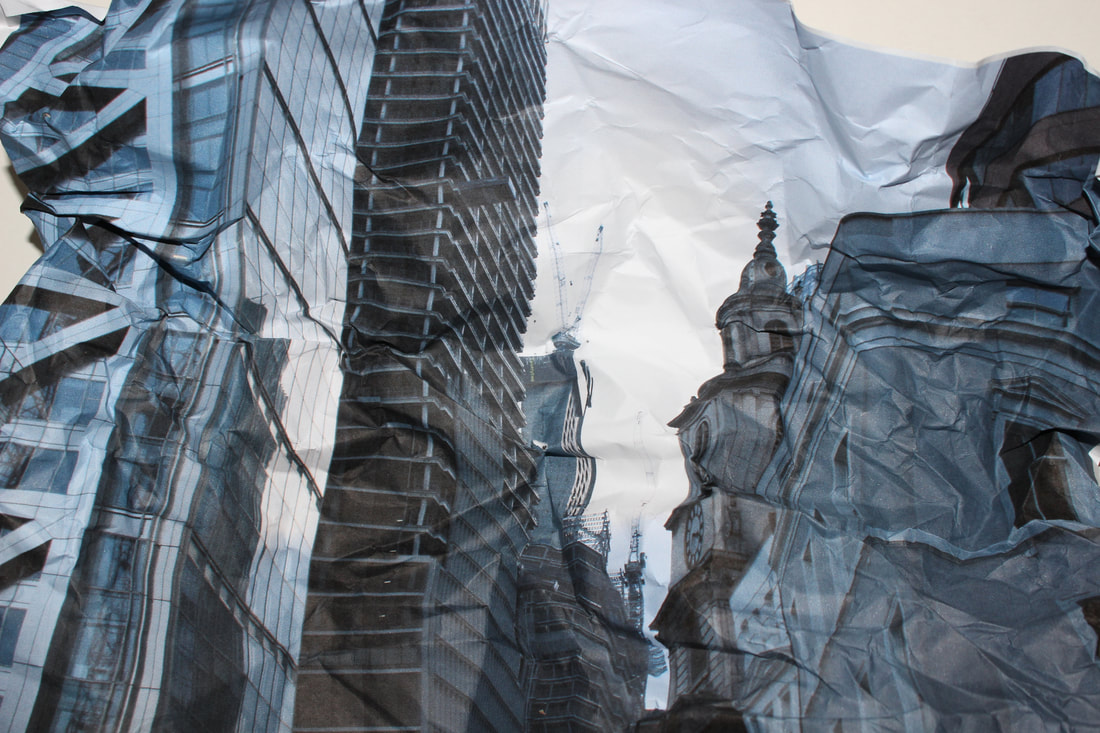
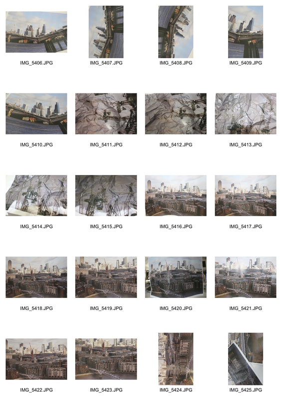
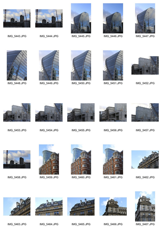
For my next developments I will take pictures of London skylines and skyscrapers used for offices. I will then print them off on A3 paper and fold and abstract the image then retake the picture. By abstracting them I am trying to show what the buildings look like from a more ethical perspective for example portraying the corruption crookedness in the seemly straight and crystal clear sky scrapers and establishments.
final images to be abstracted
I have printed out the images above on A3 paper and I will now fold, bend and shape them then rephotograph them. This is showing the coruption and the twisted nature of the banks that
|
|
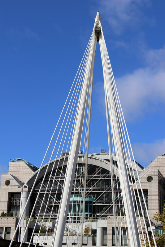
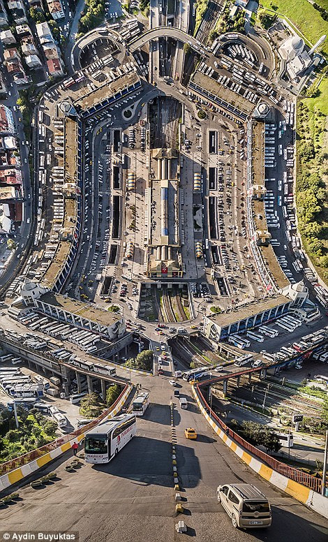
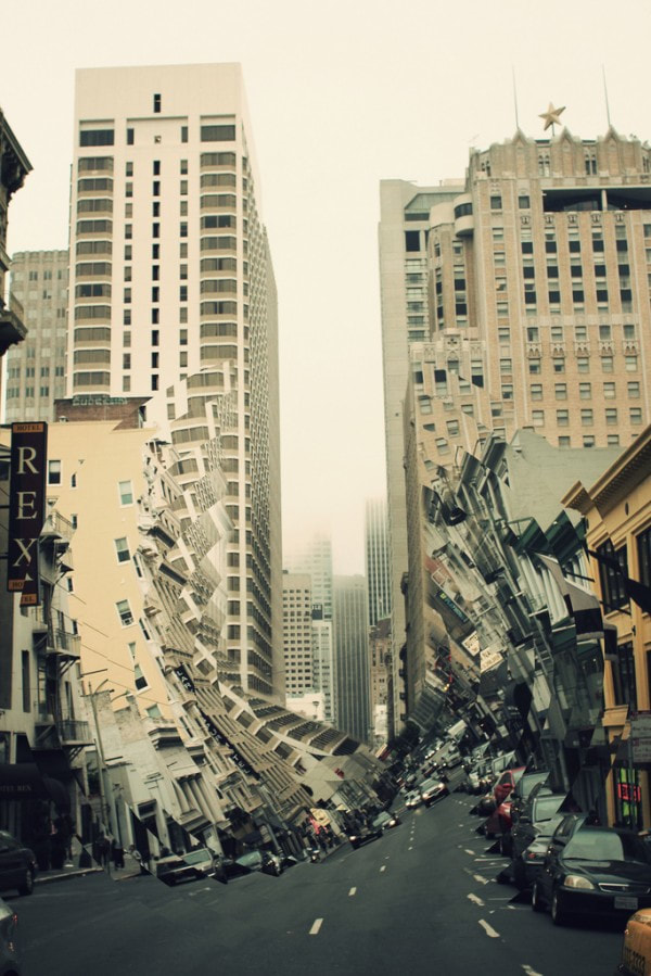
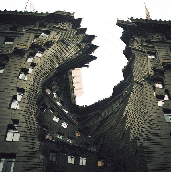
artist and me: Aydın Büyüktaş
AYDIN BÜYÜKTAŞ was born in Ankara, Turkey in 1972. His work focuses on surreal folding landscapes in Istanbul where he lives. BÜYÜKTAŞ uses drones and 3D software top achieve this bending effect.
|

|
|
my response
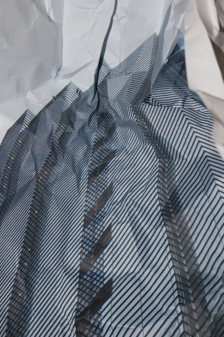
Originally I printed the images on A3 paper, I then in the studio abstracted the images by a mixture of bending, folding and scrunching up paper. I then took pictures of the paper, I put the paper on a white card background and used the studios house lights to give a pure effect.
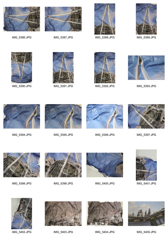
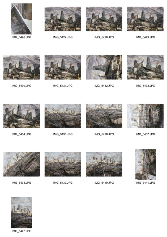
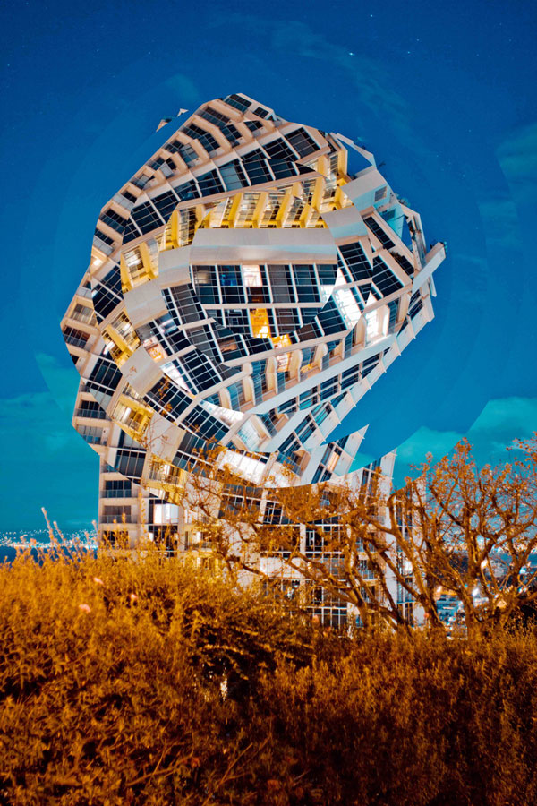
final images
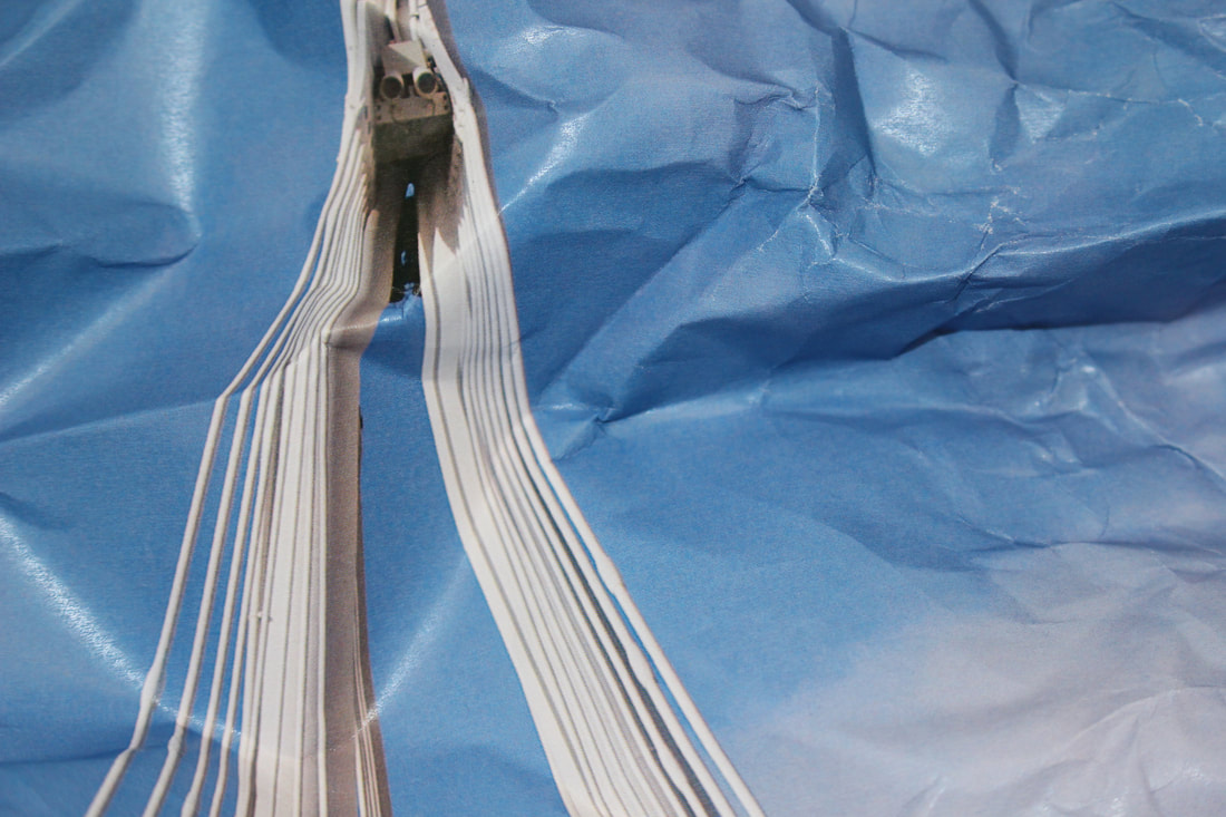
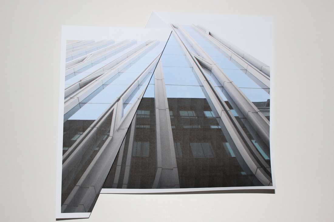
WWW
To get this image I zoomed in on the crumpled piece of paper abstracting the image, the structure no longer looks like a bridge, it looks like something space age. The blue crumpled paper also looks like the waves in water, this gives a nice effect as the picture now looks like something that it is not.
EBI
Next time I might experiment with using a softer lighting arrangement to try and get rid of the reflections
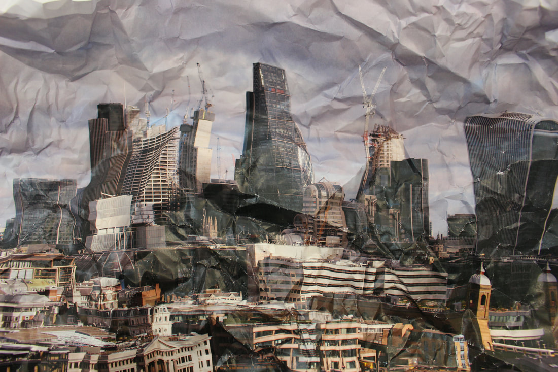
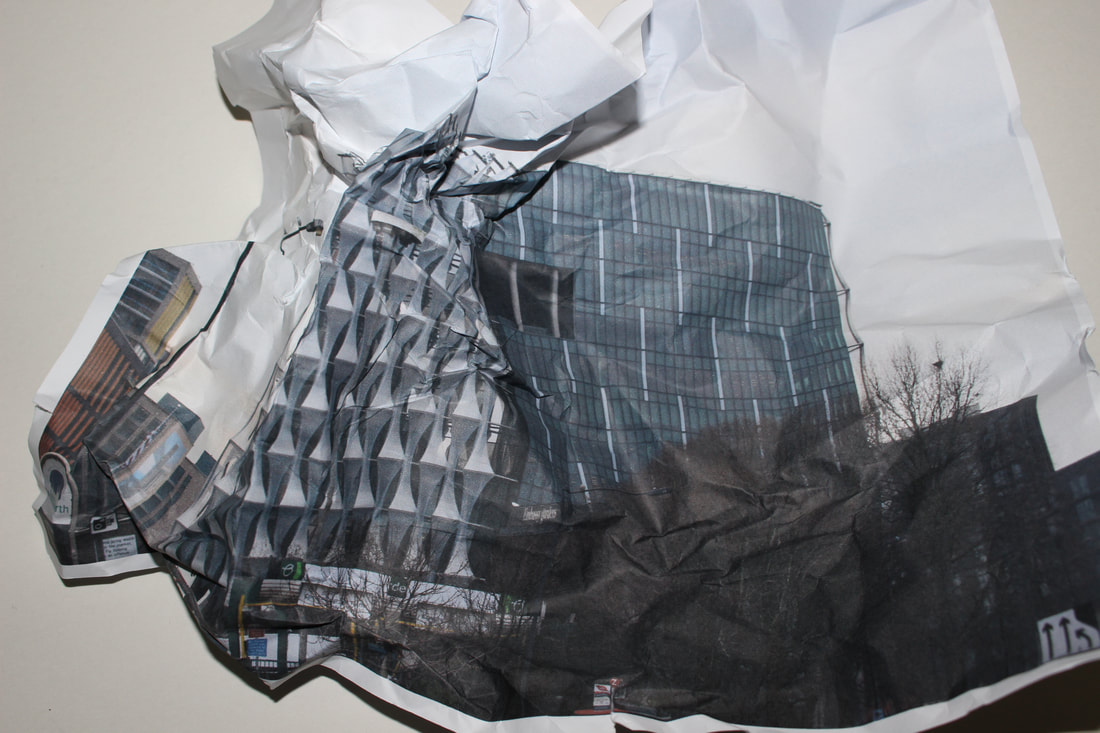
WWW
This crumpled paper gives the effect that this London skyline has been destroyed.
EBI
Skylines are not focused enough, I need to focus more on one or a few buildings which have more significance than just a collection of high-rise buildings.
This crumpled paper gives the effect that this London skyline has been destroyed.
EBI
Skylines are not focused enough, I need to focus more on one or a few buildings which have more significance than just a collection of high-rise buildings.
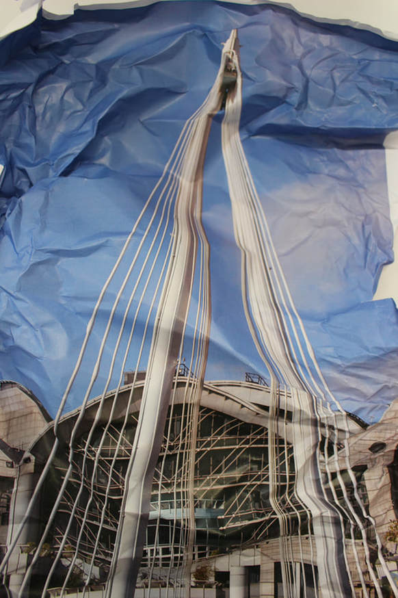
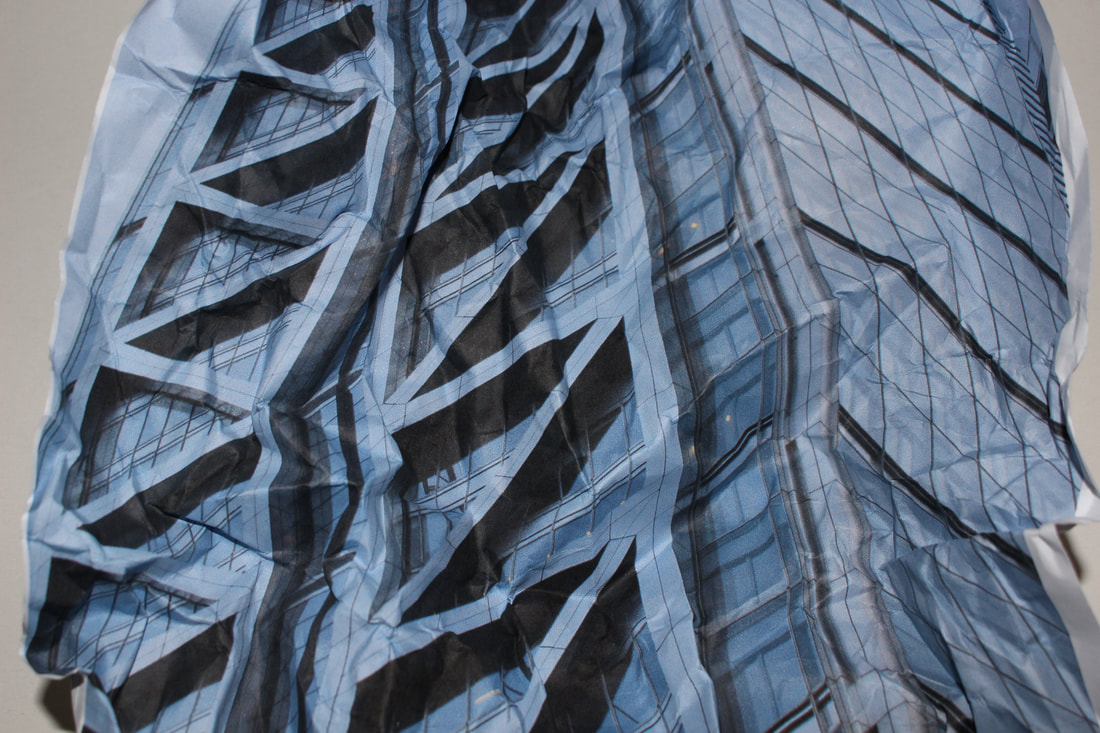
WWW
The folded bent paper gives the picture texture, it makes the picture more interesting as the usually straight pillars of the bridge are now warped and misshapen. The strong blue colour in the sky gives a big contrast between the building and its background.
EBI
The picture would be better if the structure was a Banking office building or something along those lines so the picture and the fact that it is warped symbolises something.
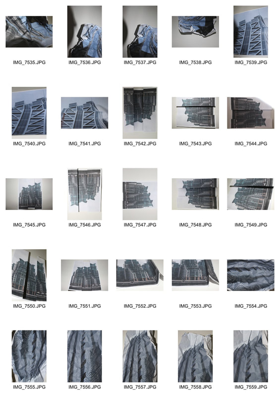
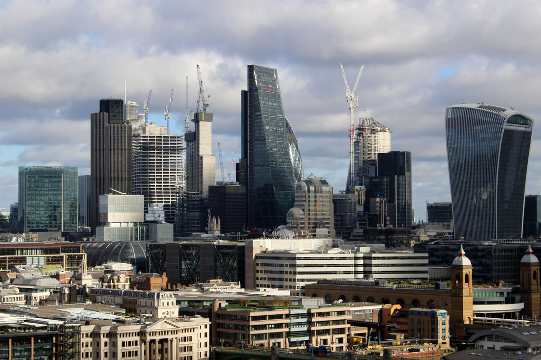
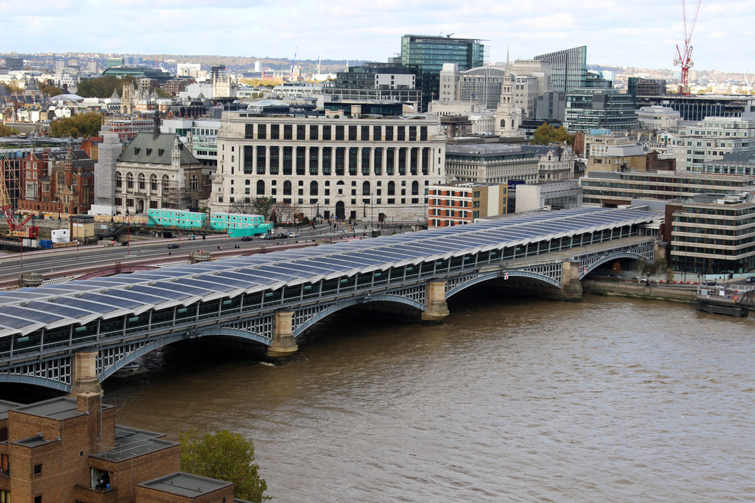
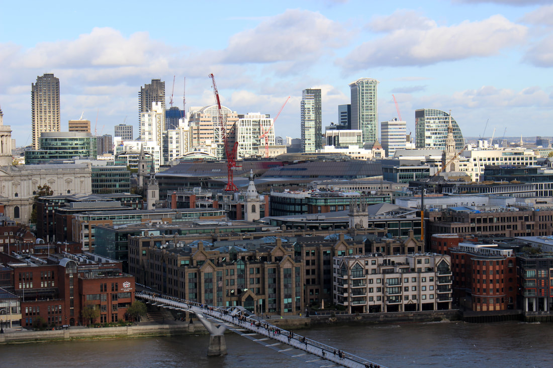
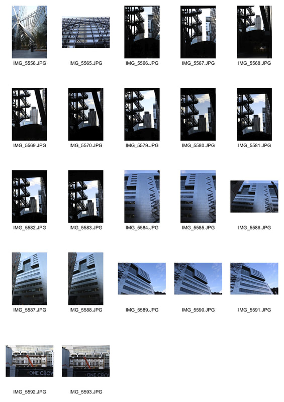
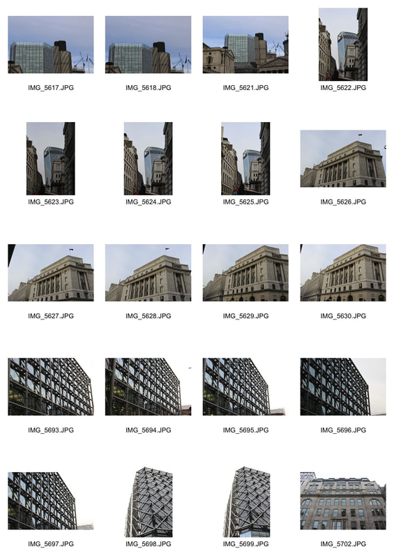
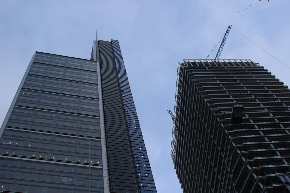
development 5 canary wharf
I went to Canary Wharf in London as it is an active financial area filled with sky scrapers home to some of the biggest banks in the world.
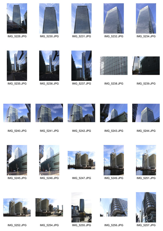
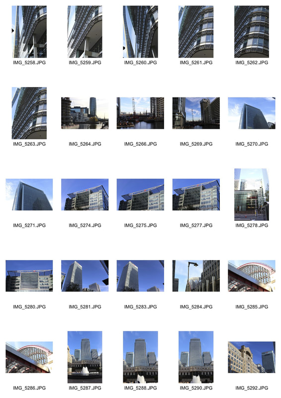
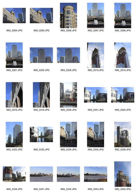
See final images below.
development 6
Lloyds banking group
I went to one of Lloyds Banking Group's office buildings, my aim for this development is to abstract the images to show the corruption of the banking sector in this country.
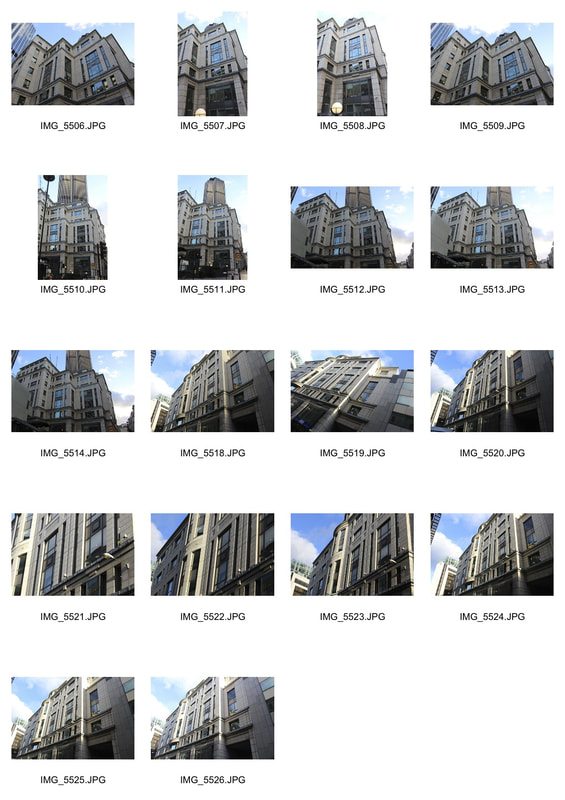
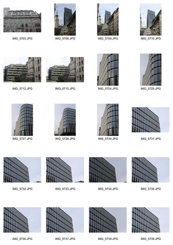
other buildings around moorgate
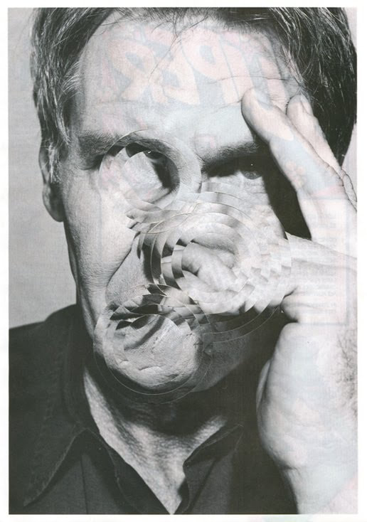
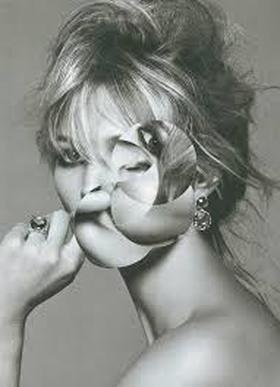
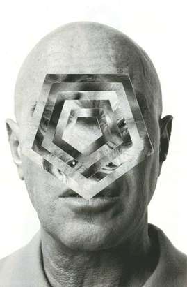
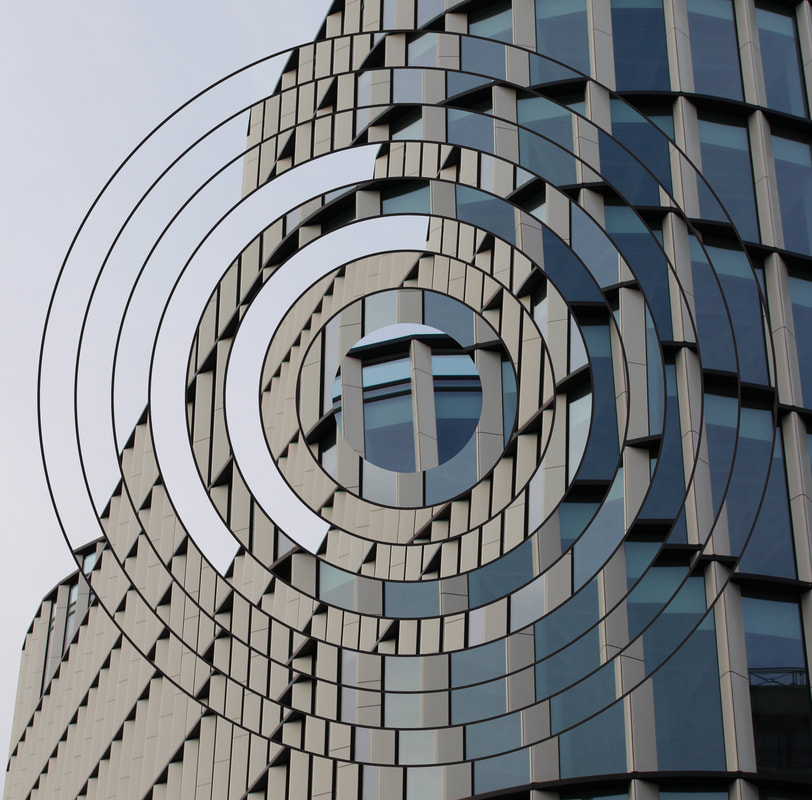
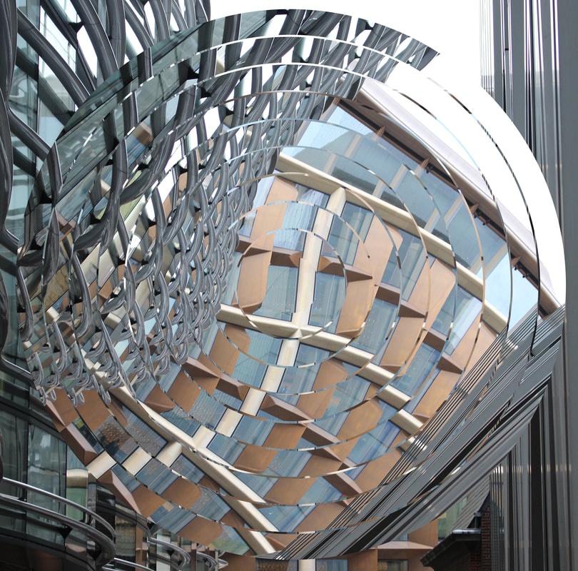
Gordon Magnin technique
|
|
|
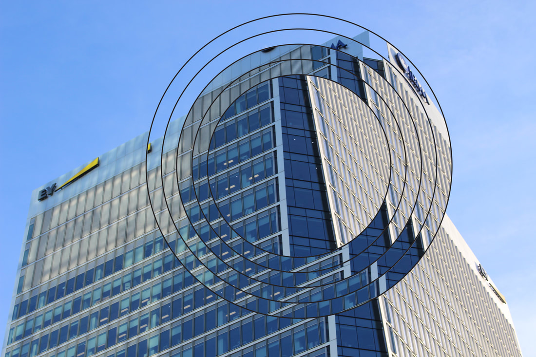
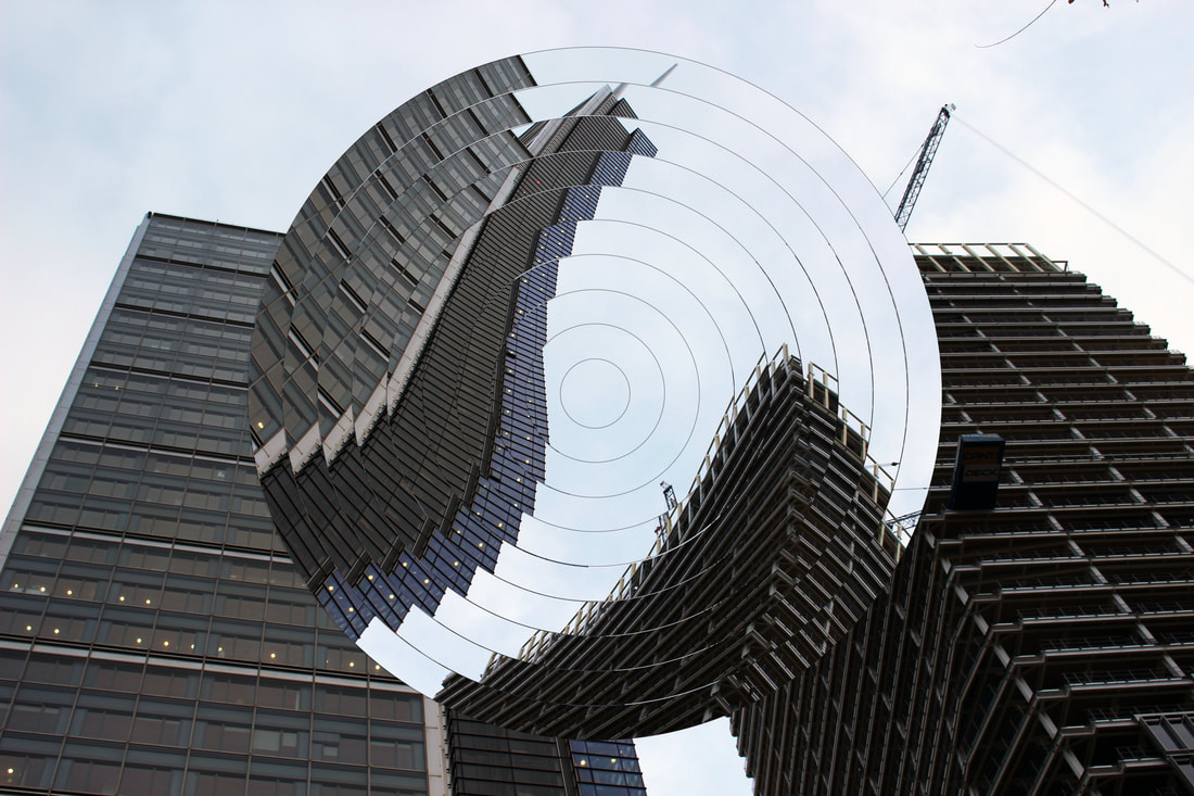
I am going to use Magnin's technique of using circles and other shapes to distort the subject and apply it to my own pictures of buildings.
Development 7
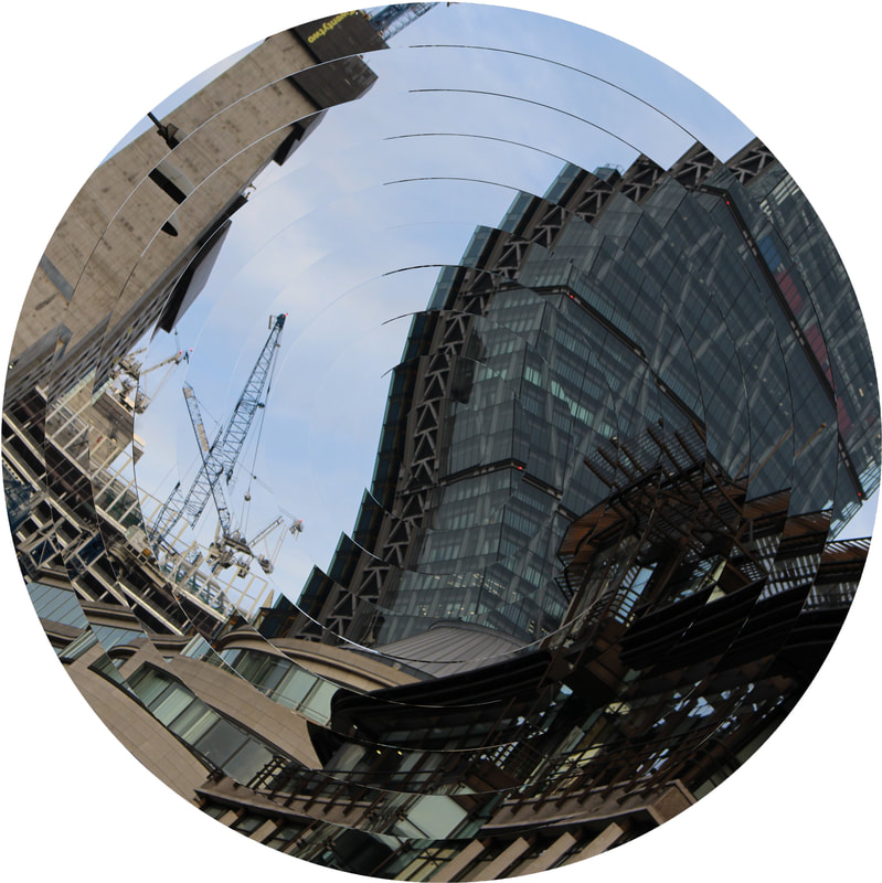
original image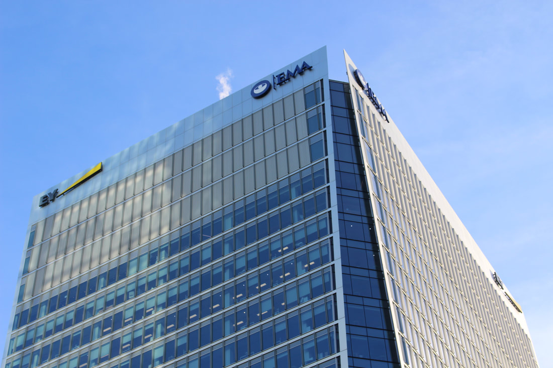
|
|
|
EBI
The picture would look better if the circles were centred, also the original photo seems blurry and doesn't offer a great contrast as the building and the sky are all very similar shades of blue. If I was to do it again I would edit the original picture much more or even choose a different one, and I would also centre the circles and take the black line out so the circles were less obvious as it draws attention away from the abstracted building.
The picture would look better if the circles were centred, also the original photo seems blurry and doesn't offer a great contrast as the building and the sky are all very similar shades of blue. If I was to do it again I would edit the original picture much more or even choose a different one, and I would also centre the circles and take the black line out so the circles were less obvious as it draws attention away from the abstracted building.
|
|
|
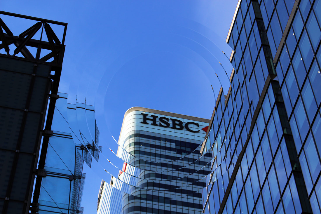
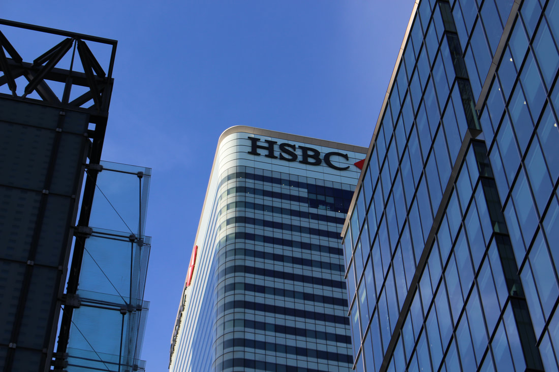
WWW
The HSBC logo in the middle of the circle makes it the focus of the image.
EBI
The picture is very blue as the sky is reflected of the windows of the skyscrapers, like the other picture there still isn't a lot of contrast.
The HSBC logo in the middle of the circle makes it the focus of the image.
EBI
The picture is very blue as the sky is reflected of the windows of the skyscrapers, like the other picture there still isn't a lot of contrast.
|
|
|
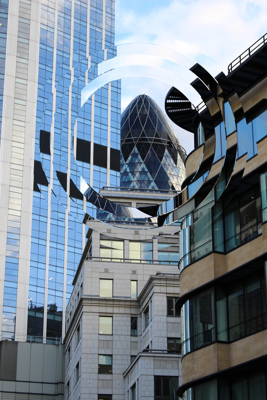
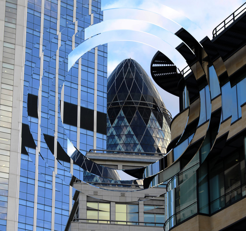
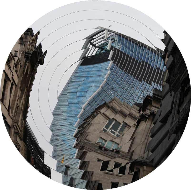
WWW
I positioned the middle circle so that the Gurkin was fully in shot making it the focus point of the image, it also makes the building seem bigger than it actually is.
EBI
Next time I will make he circles continue into the centre of the picture as the picture is not abstracted enough as the outlines of the buildings are still clear.
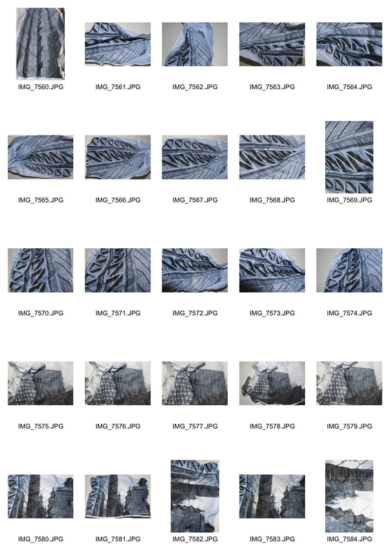
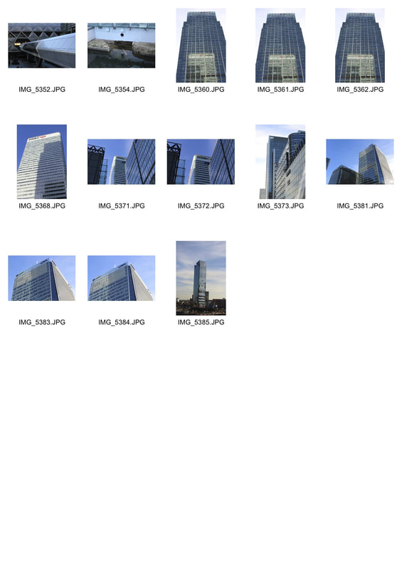
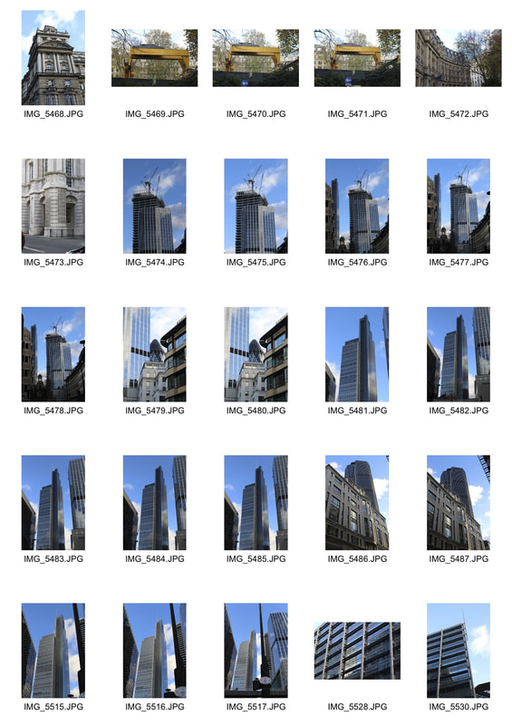
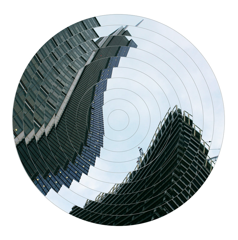
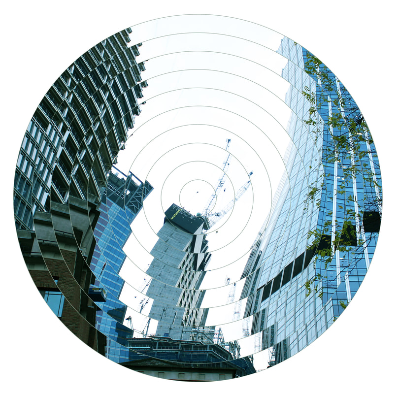
development 8
rothschild's head office
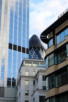
I went to Rothschild Banks head office, this is the address, New Court, St Swithin's Ln, London EC4N 8AL. I chose this building because of the interesting vertical metal cladding that broke up the glass as I can later abstract and distort the structure.
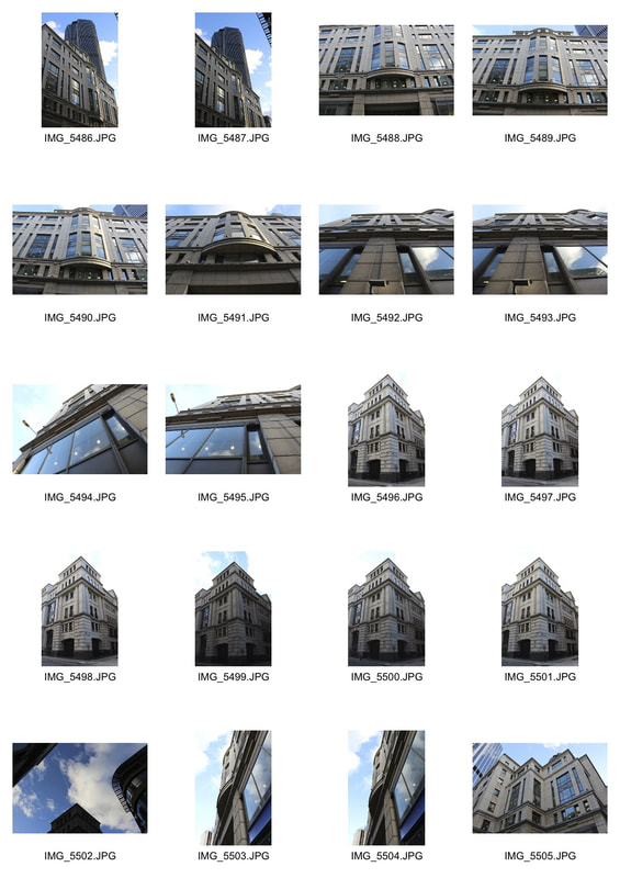
Other shots around bank
WWW
The buildings interesting curves and diagonal lines gives the image an interesting look. The circles play with the lines and the axis of the picture as they are all slightly out of place and in some cases a lot out of place.
EBI
The links between the circles are too random, next time I will rotate the separate circles instead of selecting different parts of the image and copying and pasting them in between the lines. As well as that next time I will change the thickness of the circles as the thick bold lines are distracting and shouldn't be part of the picture.
nicholas kennedy sitton
Sitton looks at how the concept of distortion translates to architecture, his pictures seem to fall in on themselves as if they were being demolished right when he took the picture.
|
|
|
development 9
Next time to experiment I will rotate the circles from the outside in instead of what I did here from the inside out.
WWW
The building made of glass and the two grey old building provide a really strong contrast.
The building made of glass and the two grey old building provide a really strong contrast.
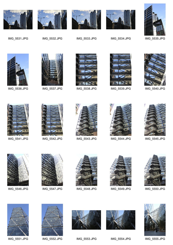
heron tower -110 BISHOPSGATE, EC2
sky gardens- 155 Wandsworth Rd, Nine Elms, London SW8 2FZ
sky gardens- 155 Wandsworth Rd, Nine Elms, London SW8 2FZ
mock
heron tower and other buildings
|
|
|
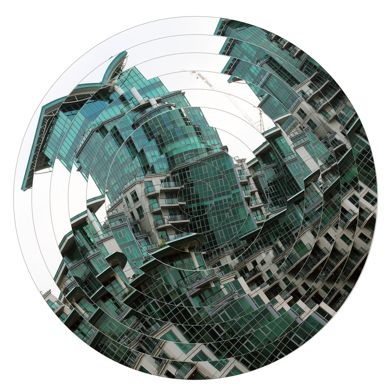
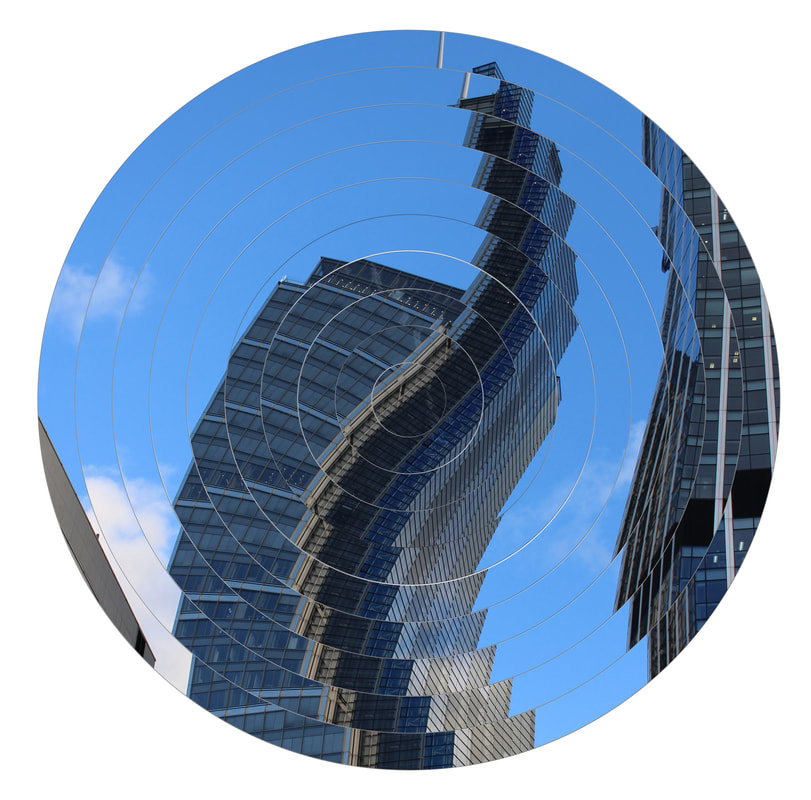
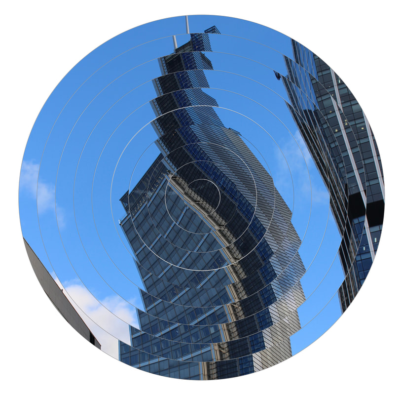
WWW
With this picture I started from the middle circle and turned it clockwise by 5 degrees, I then moved each one 5 degrees more than the last. This makes the building on the left look jaged and the one on the right look like its curving like a wave about to break.
EBI
The colour is bland however and doesn't stand out. To develop this picture I would experiment with using colour balance and brightness and contrast on Photoshop.
|
|
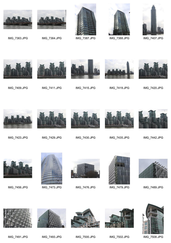
WWW
This is St George Wharf residential complex in Vauxhall. For this picture I started to rotate in the middle and instead of moving each section clockwise I turned them anti-clockwise to see If it would give a different effect.
EBI
Next time to compare, I will use the same image and make one clockwise and one anticlockwise to effectively compare them.
Development 10
Clockwise
|
Anti-clockwise
|
development 11
I printed out my images of banks and other buildings on A4 paper I then abstracted them by doing a mixture of folding and scrunching, then I took a picture of the paper. I used the house lights in the studio and the flash on my camera to make it seem like natural light.